Reflection
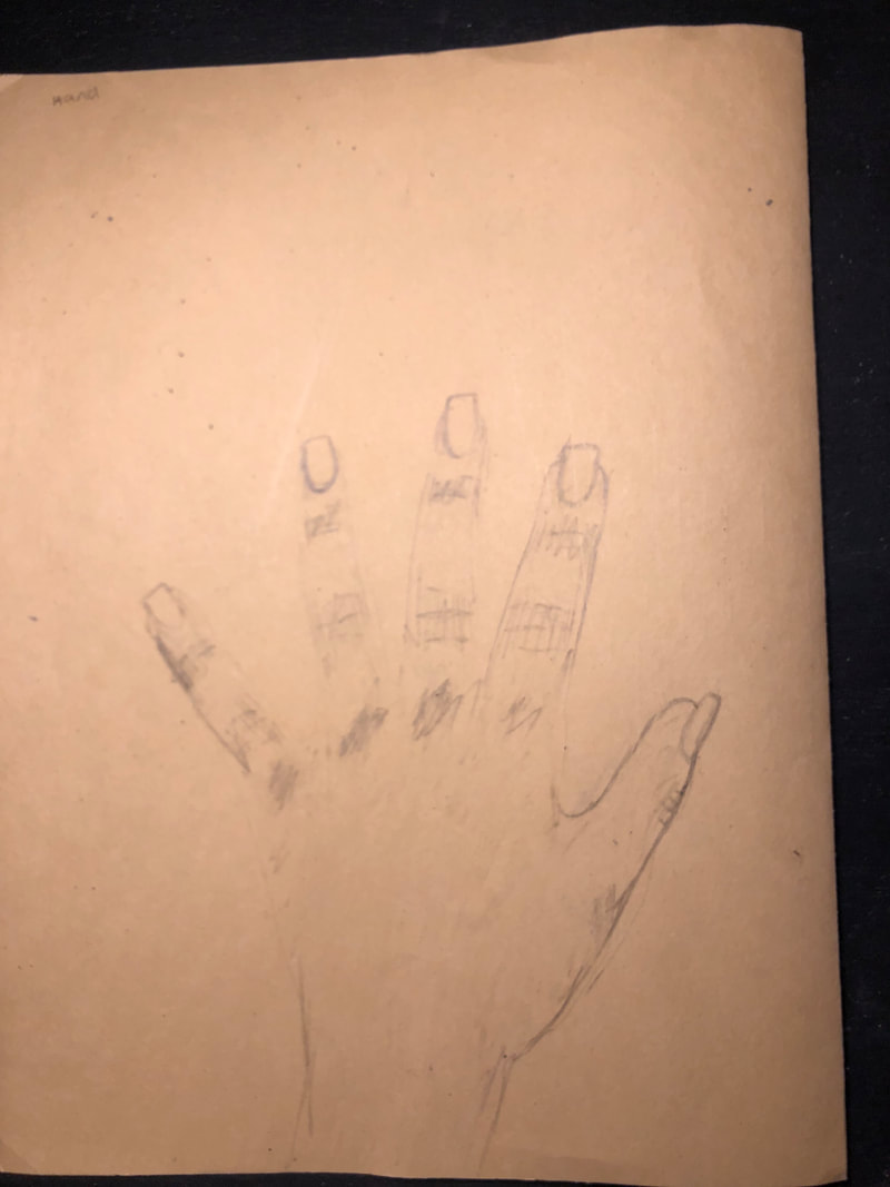
I learned a lot from this class. I came into drawing knowing nothing as I didnt take art 1, im now leaving the class much more knowledgeable about drawing. I learned how to draw facial features and proportions of objects. I especially liked learning about contour lines and outlining the whole classroom and our hands using contour lines. I feel like I learned the most from that unit. I had a lot of personal growth this semester too in drawing. you can see in my first post where we had to draw four pictures my first attempt at a hand, a few posts later you can see a much better drawing of a hand using contour lines. Same with the perspective drawing from the first four drawings, I had no idea what perspective It was I was supposed to draw in and had to look it up, but later in my posts we did perspective drawings and the growth is shown in my final piece.
Starting this class I thought there was absolutely no way I could draw a human face at all let alone decently. When learning how to do the facial features and then doing portraits I felt some pride and accomplishment in my work. I know its not the best but I thought it was well done and especially good because of all the time I put into it. It was also very cool learning about all the different tools and mediums to use while drawing, such as charcoal, colored pencil, and scratchboard. I really liked using charcoal and learning how to properly blend it. Over all I really enjoyed this class and putting time and effort into pieces I enjoy.
Starting this class I thought there was absolutely no way I could draw a human face at all let alone decently. When learning how to do the facial features and then doing portraits I felt some pride and accomplishment in my work. I know its not the best but I thought it was well done and especially good because of all the time I put into it. It was also very cool learning about all the different tools and mediums to use while drawing, such as charcoal, colored pencil, and scratchboard. I really liked using charcoal and learning how to properly blend it. Over all I really enjoyed this class and putting time and effort into pieces I enjoy.
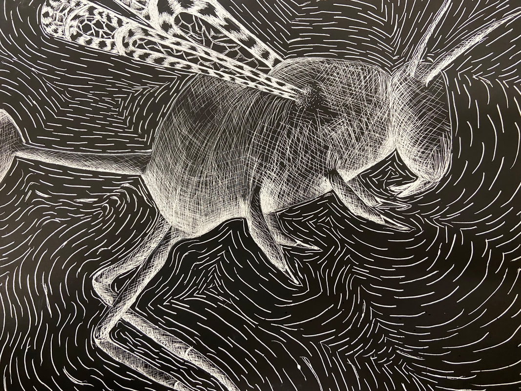
Final Scratchboard
|
In progress photos |
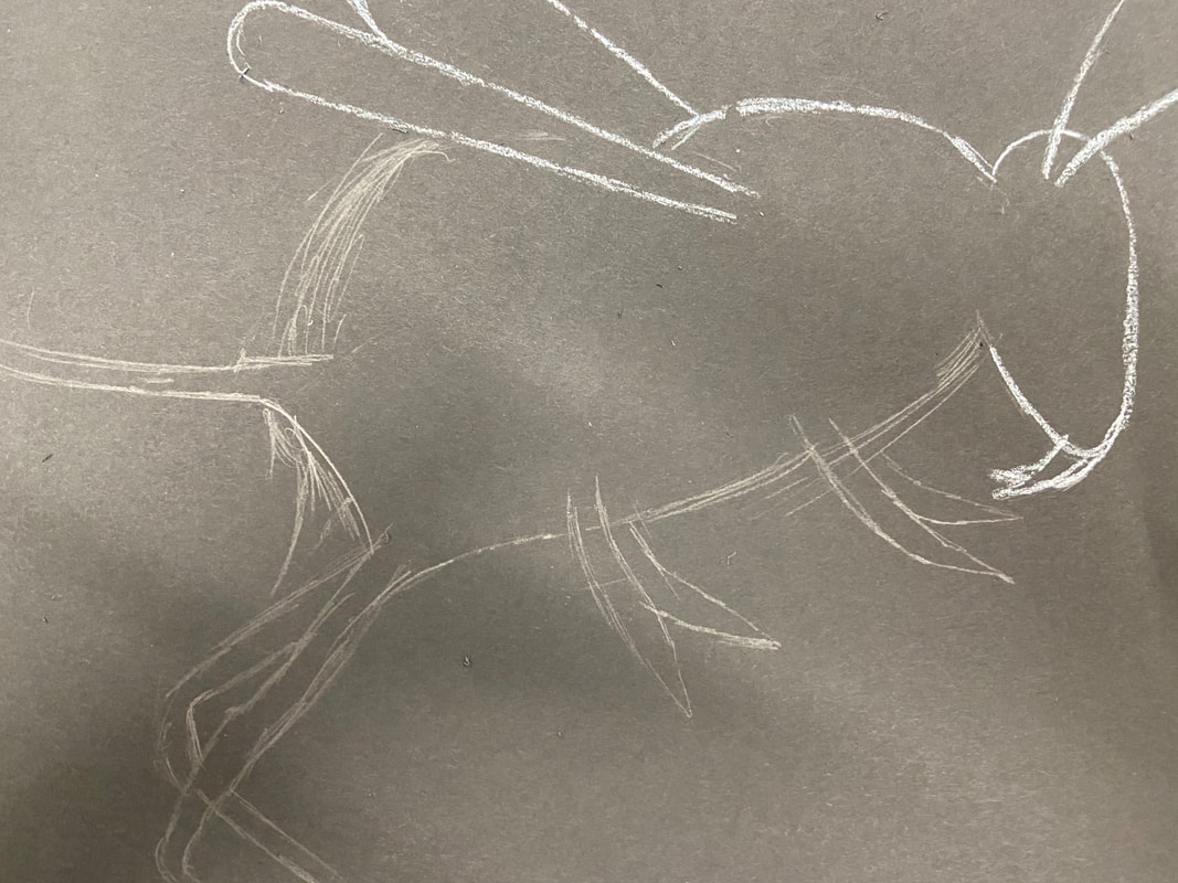
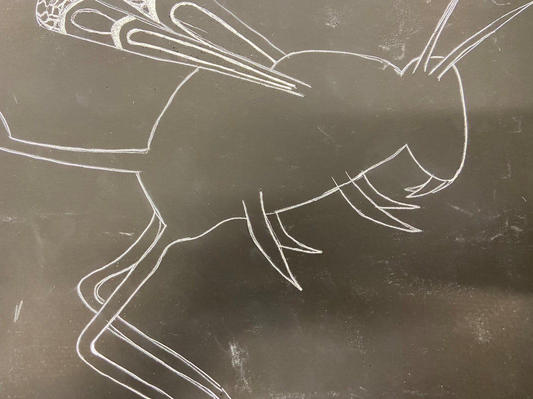
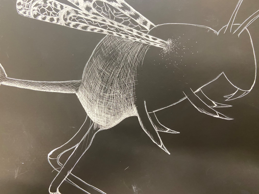
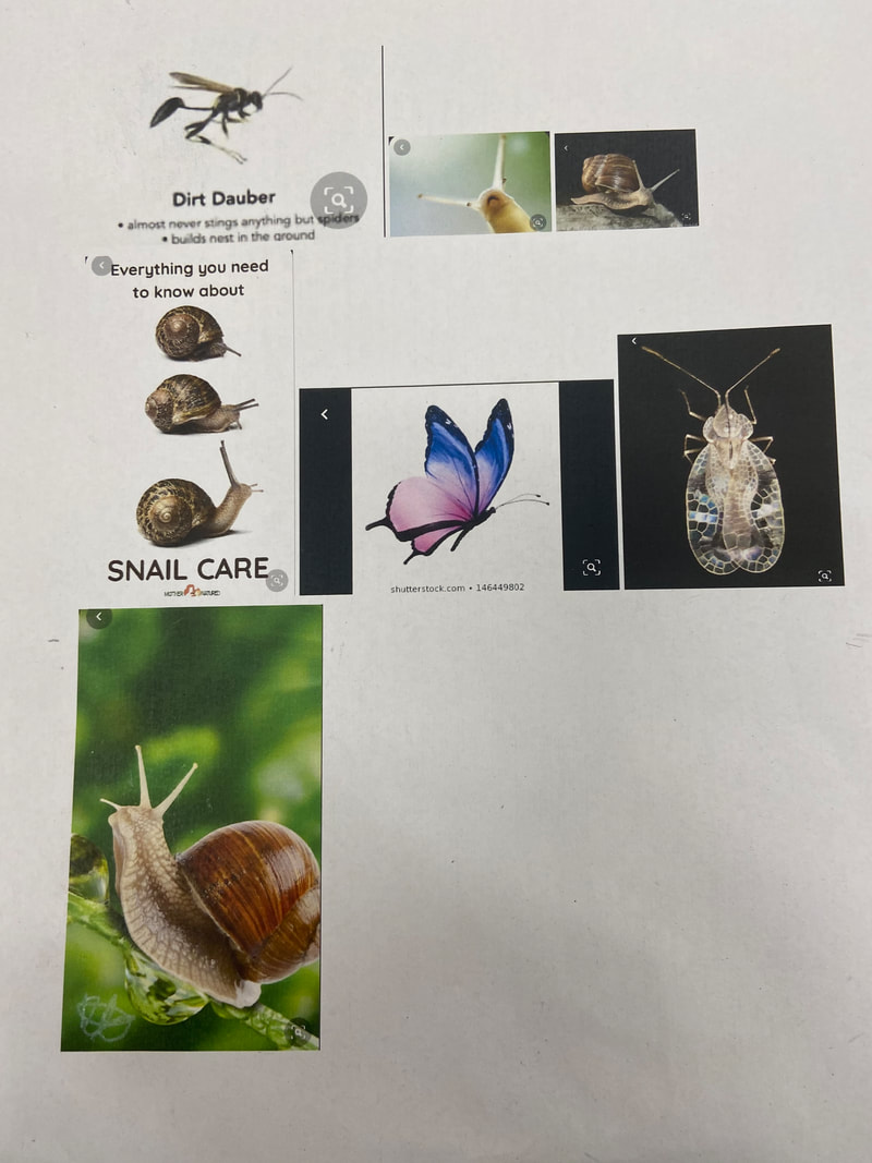
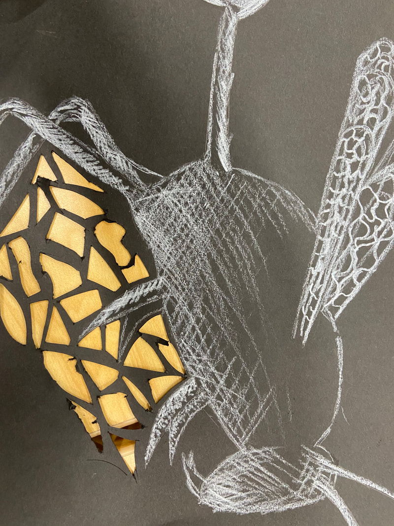
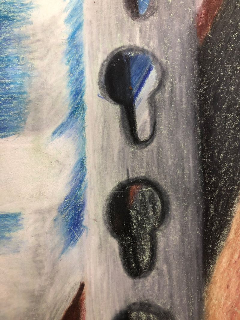
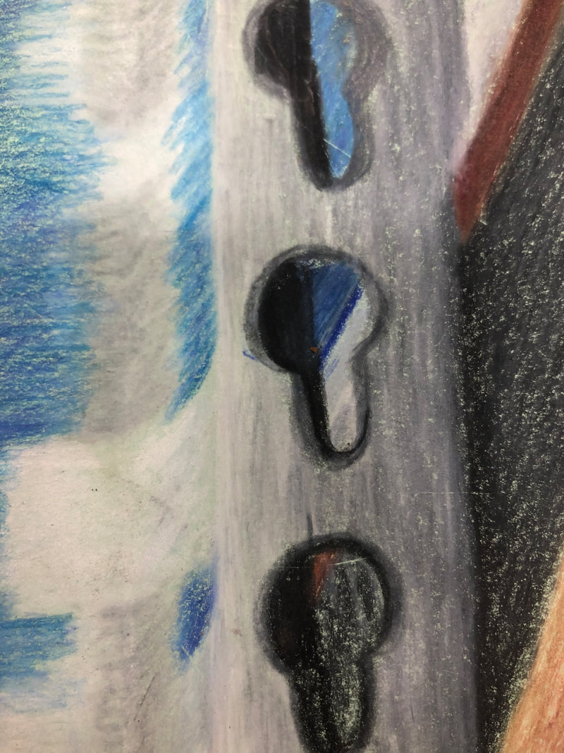
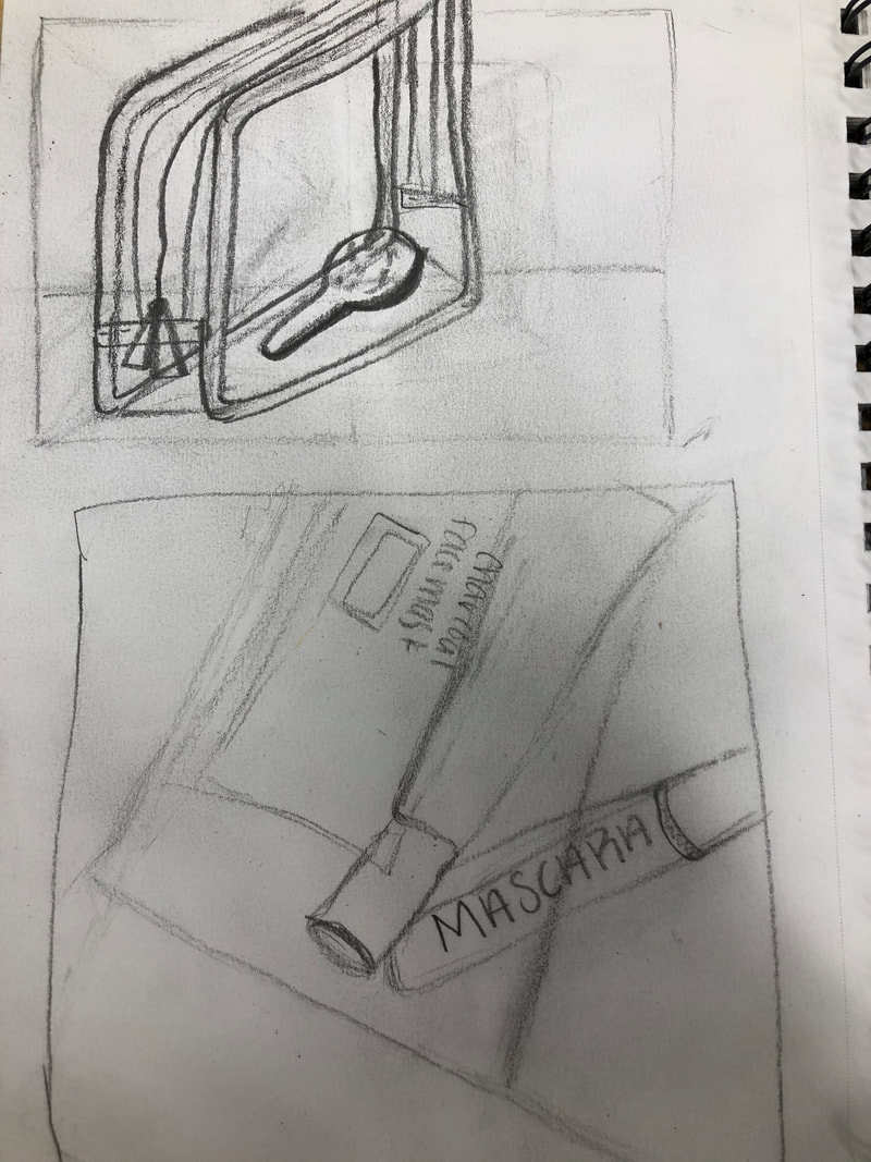
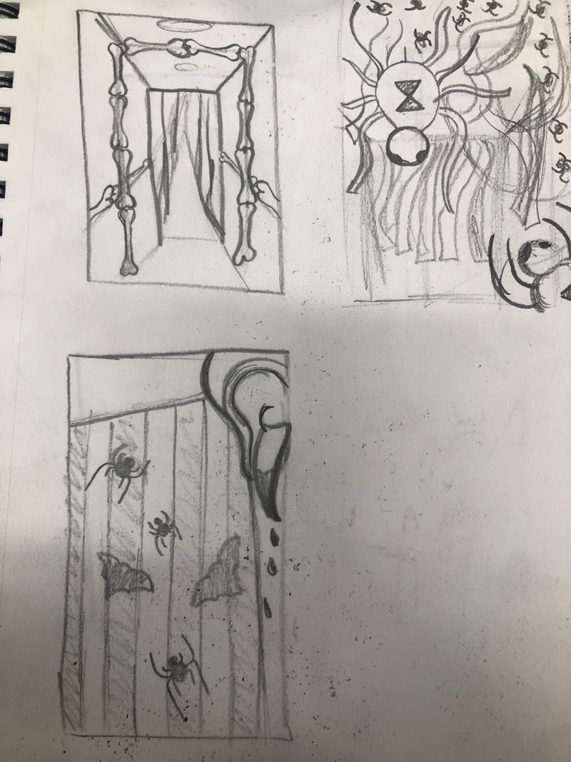
scratchboard idea and reference photosthis is my sketch on black paper with white colored pencil of what i want to do for scratchboard
|
|
In progress photos |
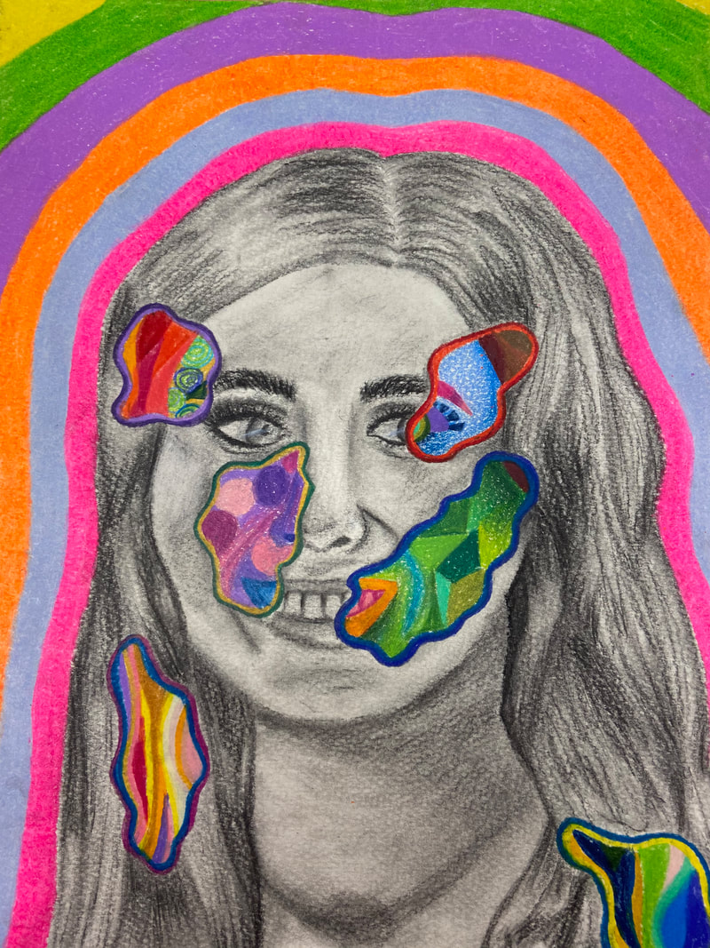
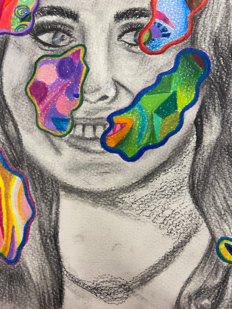
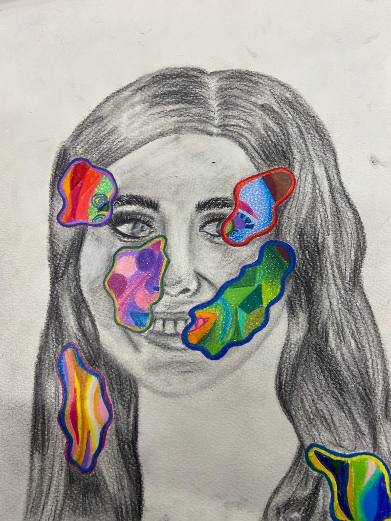
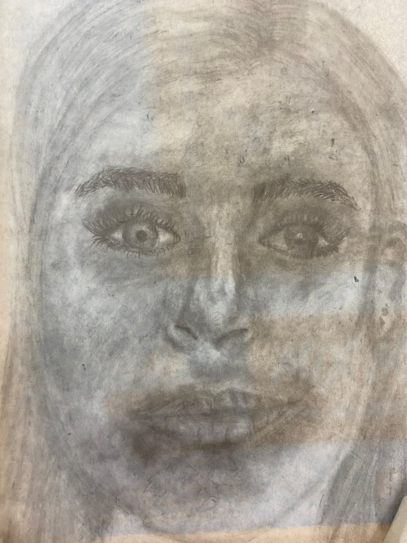
Final Portrait1. For this portrait i started with coming up with sketches and finding reference photos. Then I worked off the best Idea I had and used my favorite reference photo. I worked hard to try and draw everything right and used charcoal and pencil, both graphite and colored, and then blended everything out using a blending stump. 2. I found the different values in my portrait by basing it off my reference photo. I used charcoal and blending to show it on my portrait. 3. I feel like I have most of the value range in my portrait, the lights are seen in my eyes and nose while the dars are found in my eyebrows and hair. 4. my craftsmanship for this portrait is maybe a 7/10. I feel like it could've been blended better for sure but I have no idea how to accomplish that. I think its pretty neatly done though and I really think I executed it amazingly. 5. I was able to capture this look using bright colored pencil colors. I drew this picture with charcoal. 6.I had the correct facial feature placement using the eyeball rule and the lines down the center of my head. My eyes are one eye apart from the meeting of the lines while my nostrils are 1 1/2 eyes from the intersection and my mouth 2 1/2 eyes from the intersection. 7. It was important to know all the facial features individually and how to draw them because it helped me learn how to actually draw these features. it would've been way harder to learn all the features at once and not spend individual time on each one and how to draw it and make it better. 8. I think the most beneficial part of this unit was learning how to draw the features. I also think it was really beneficial learning how to kind of blend them together so it actually looks like a face. 9. I had no idea how to draw a face or any facial features before this, everything we learned was brand new and kind of intense but I really enjoyed learning how to draw hme and how to make it look super cool. Another obstacle was coming up with an idea that i could execute nicely. |
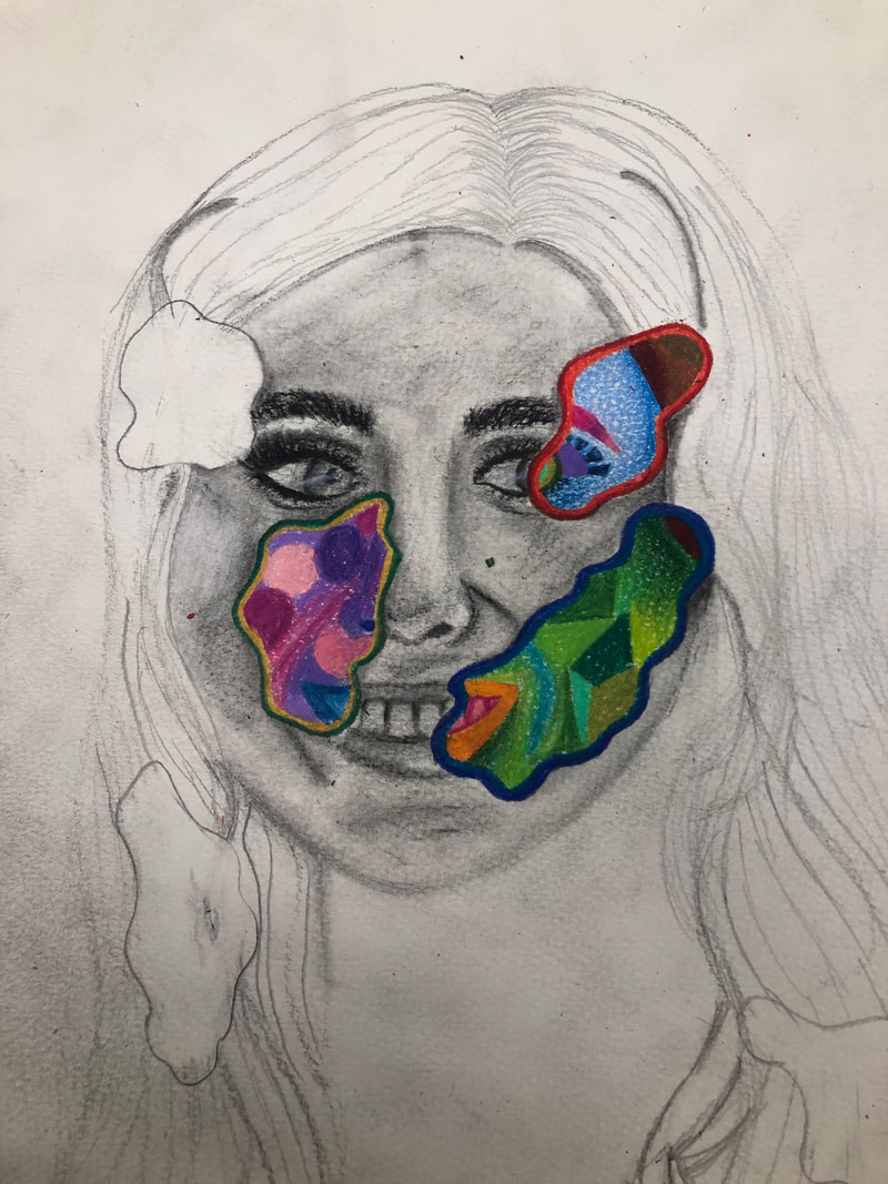
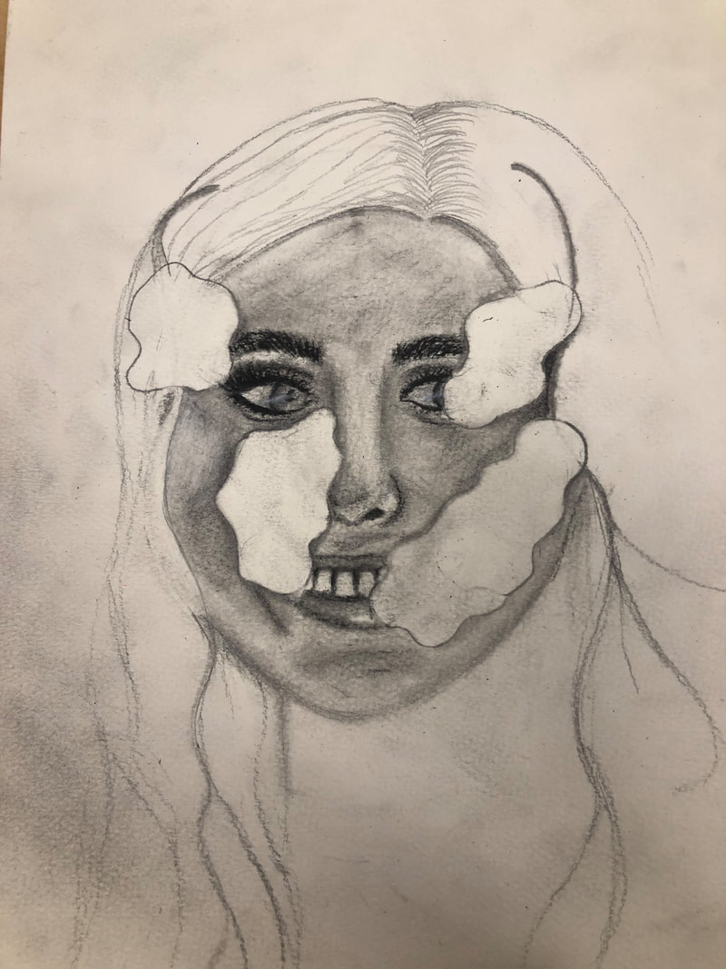
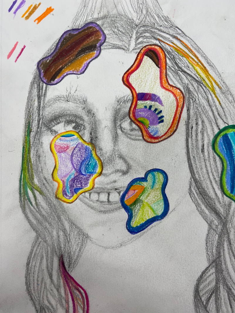
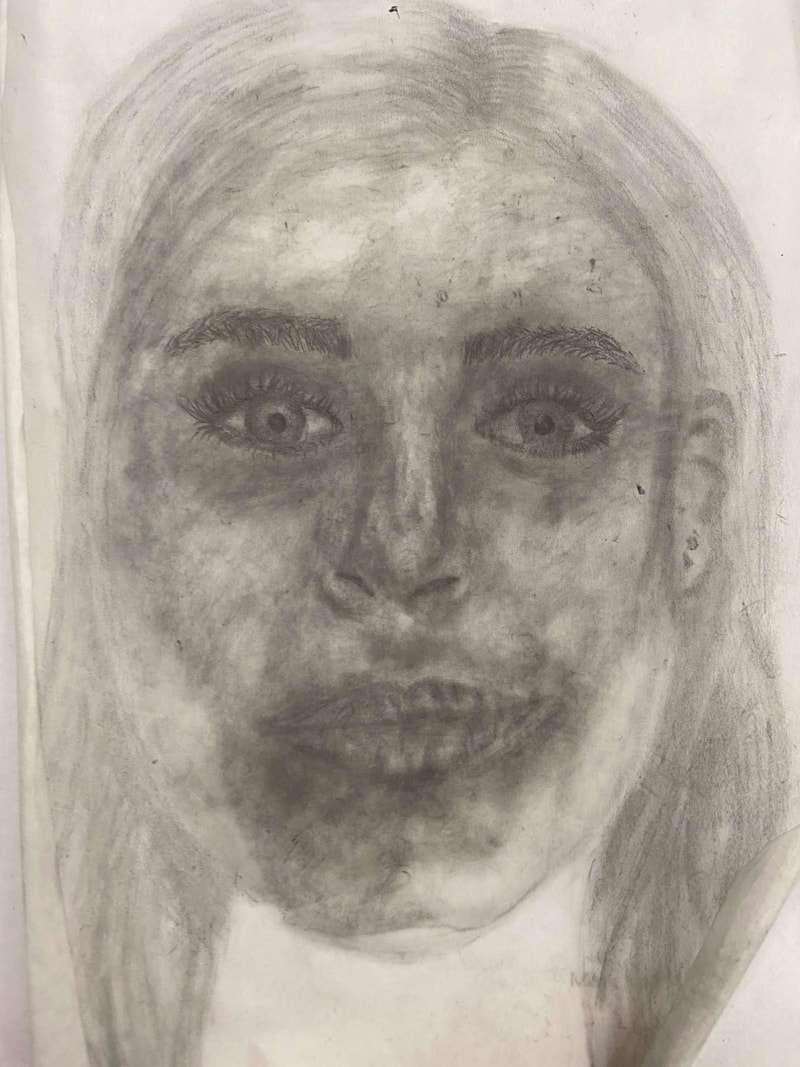
Final Portrait sketchthis is my sketch for my final portrait idea. I did this in my sketchbook and planned out how I wanted everything and where my facial features would go.
|
|
portrait sketches ideasthese are my ideas for the portrait project. we had to come up with three good ones and draw a quick sketch for them.
|
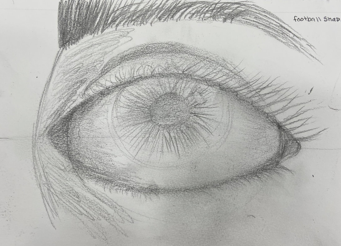
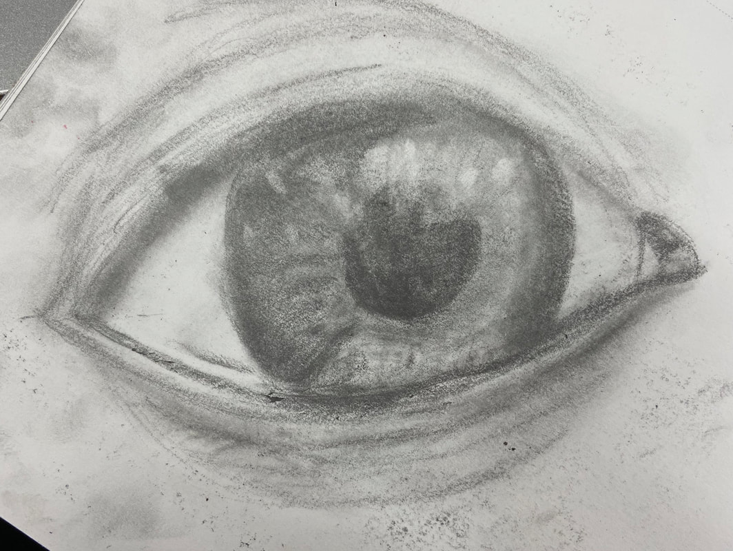
eyesThis is from when we learned how to draw eyes, one from a video and one trying by ourselves using our own photos.
|
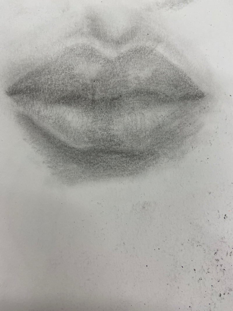
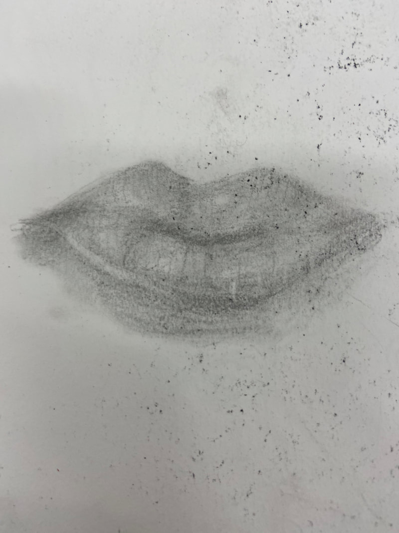
mouthsThis is from when we followed along a video showing us how to draw lips and then had to draw lips using our own reference photos of ourselves.
|
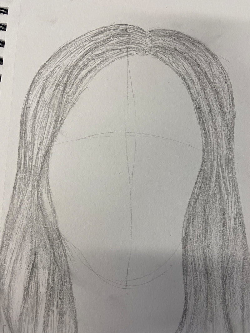
hairwatched a video on how to draw hair and then drew hair ourselves or followed along with the video.
|
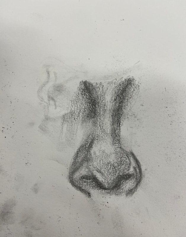
noses |
skull portrait drawing |
|
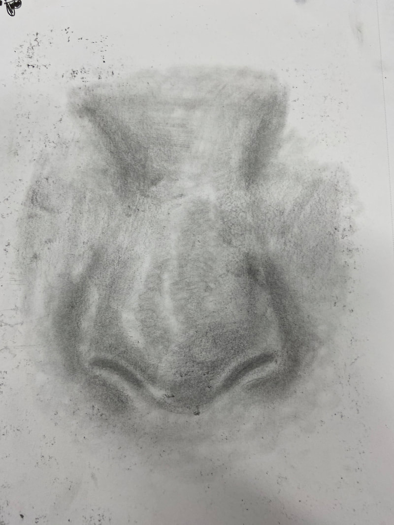
we followed along with a video then drew out own nose.
|
|
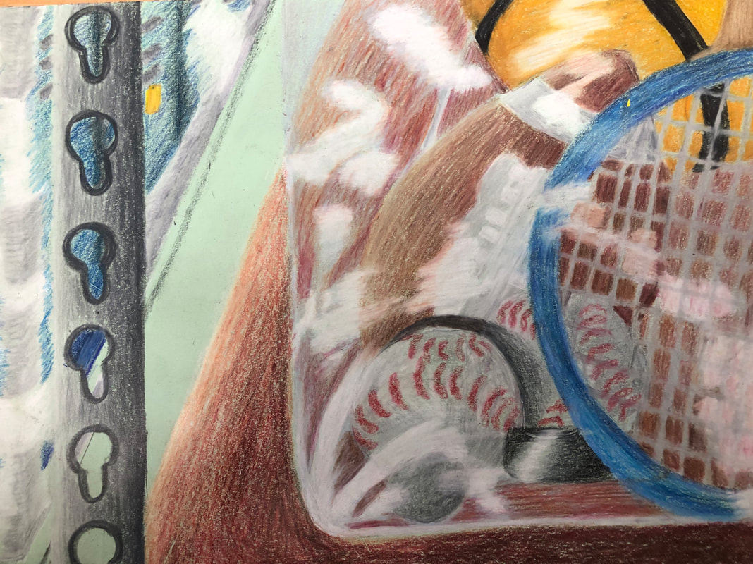
Opacity final and critique questions
|
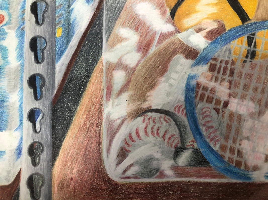
1. The craftsmanship of my drawing is maybe a 8/10 at most, I feel like it really could've been way neater.
2. Skip 3. I chose the colors of the objects in real life as well as brown for the shelves with red in it. To show depth, light, and shadows in my piece i used different colors. 4. I created contrast using the color of the shelf the bin is sat on. I also used contrast with different colors such as the orange in the basketball and the blue in the tennis racket. 5. I dont really think I used textures, but I did use shadows and highlights. i used highlights to create the light on the bin to show its a bin and shadows to show the baseball is in front of something.. 6. I chose brown and grey because the shelf would be brown and the background would be darker to either show the concrete ground of the garage of the depoth from how high up the shelf is. 7. It is very important to understand the media and to use it to create a piece you can understand and see clearly. Acquiring the skills necessary to create a successful project is SO hard. You have to learn to blend the colors and make it look really nice but also making sure all the different colors are placed in the right place. 8. I had a really difficult time with a bunch of this piece. I had a hard time figuring out how big the sports balls would be in the bin and still have it make sense. I struggled with shadows and remembering to do them and doing them well. I had a real hard time blending on the paper and making all the colors look nice and not scratchy. It definitely was a tough project but I still really liked it because it pushed me to try harder. |
Opacity in progress photos
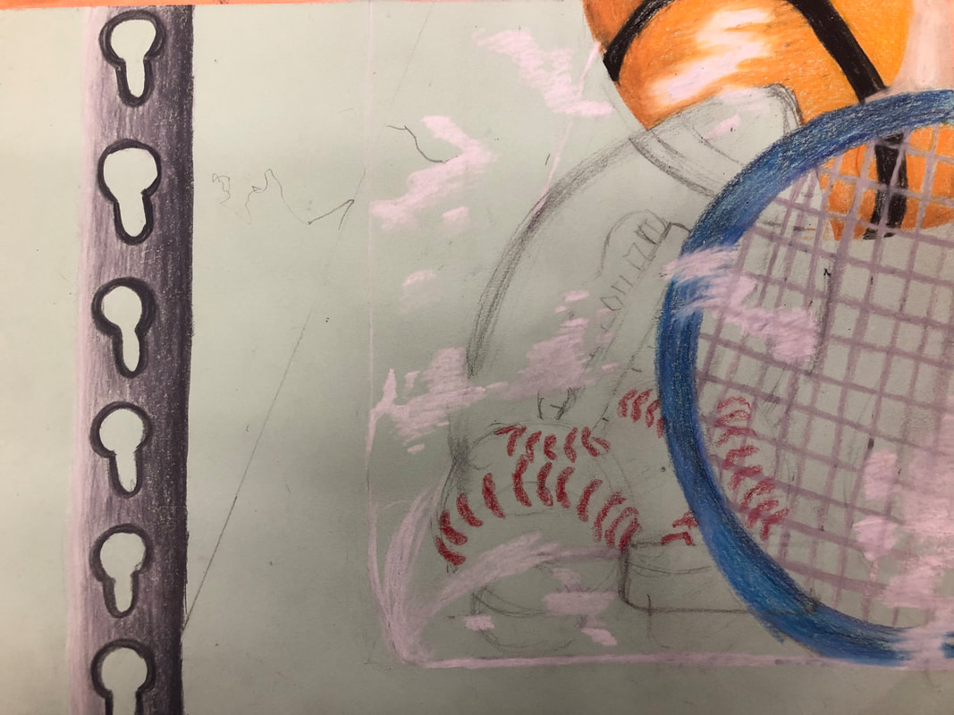
My in progress photos for the final drawing of Look what I can see through.
Opacity- reference photos and sketches (and 20 ideas)
|
|
|

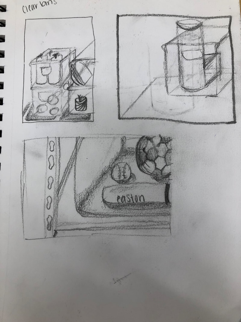
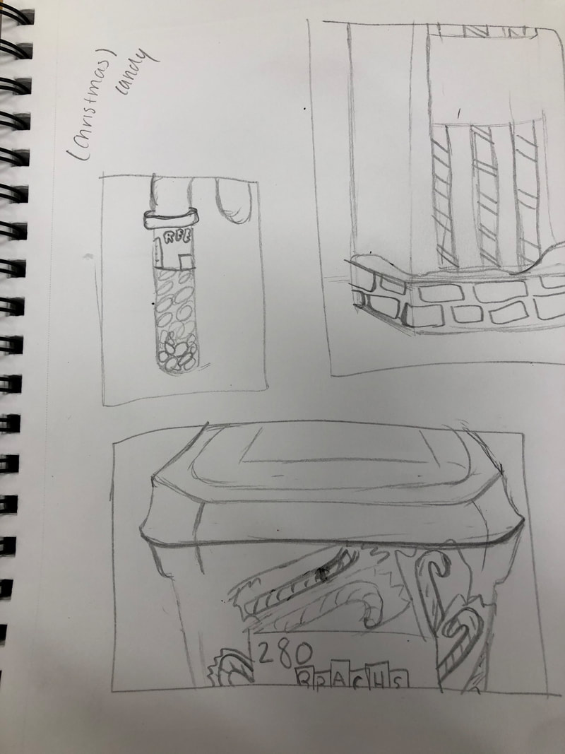
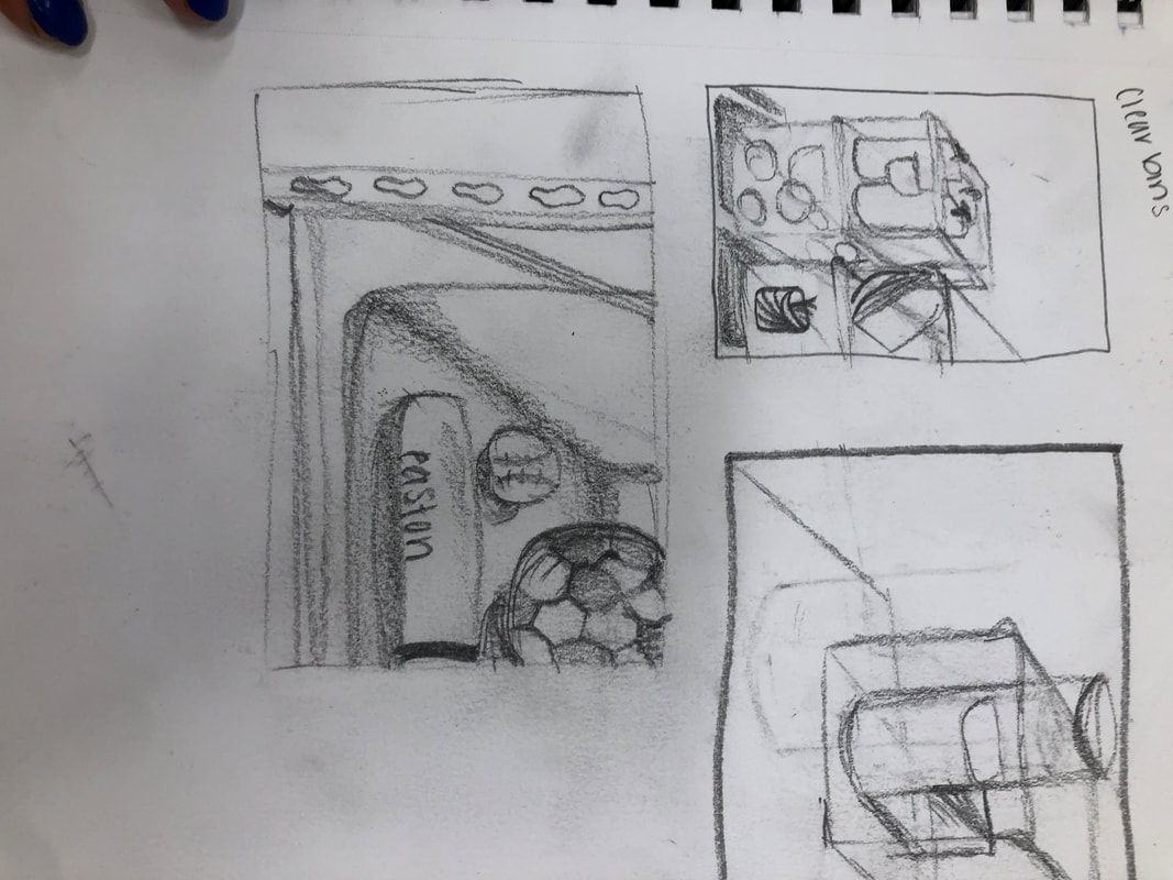
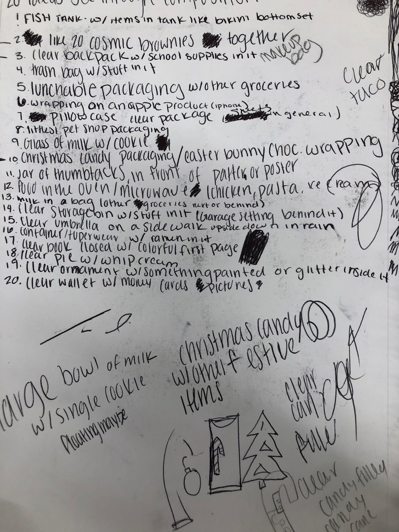
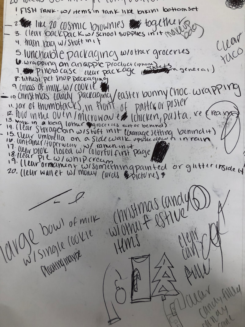
My reference photos and sketches for ideas for the look what I can see through drawing.
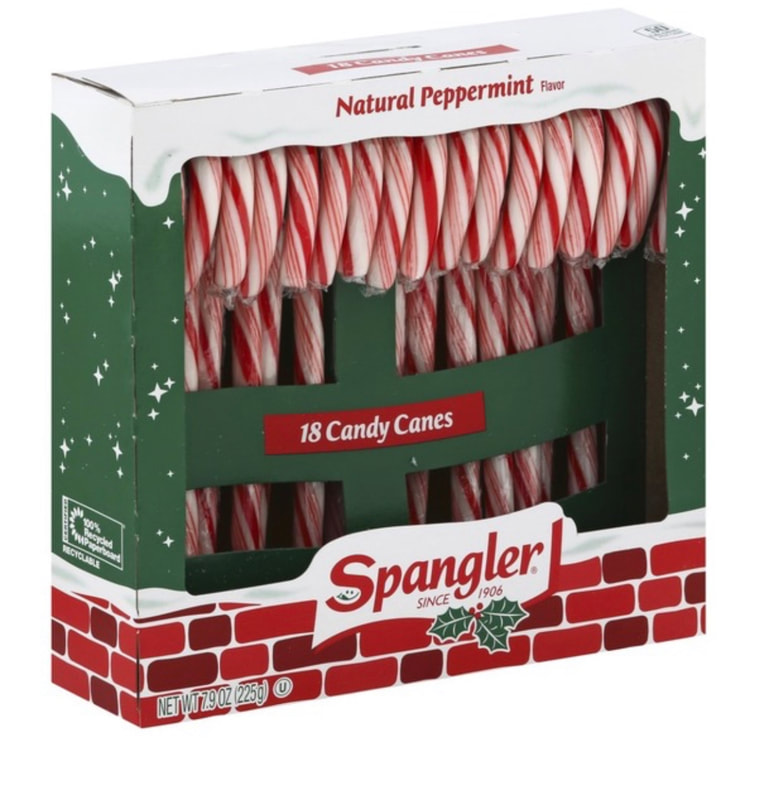
Opacity practice - mint candy |
Opacity- multiple candies |
using colored pencil, we practiced drawing transparent items. I drew a mint. we had to use a white colored pencil on black paper. We had to draw where the light hits the wrapper.
|
Using colored pencils, I drew an upclose of jolly ranchers and used different colors to show folds in the wrapper. I also had to draw the white to show the light hitting. I had to draw the white parts of the light hitting first then draw it all underneath.
|
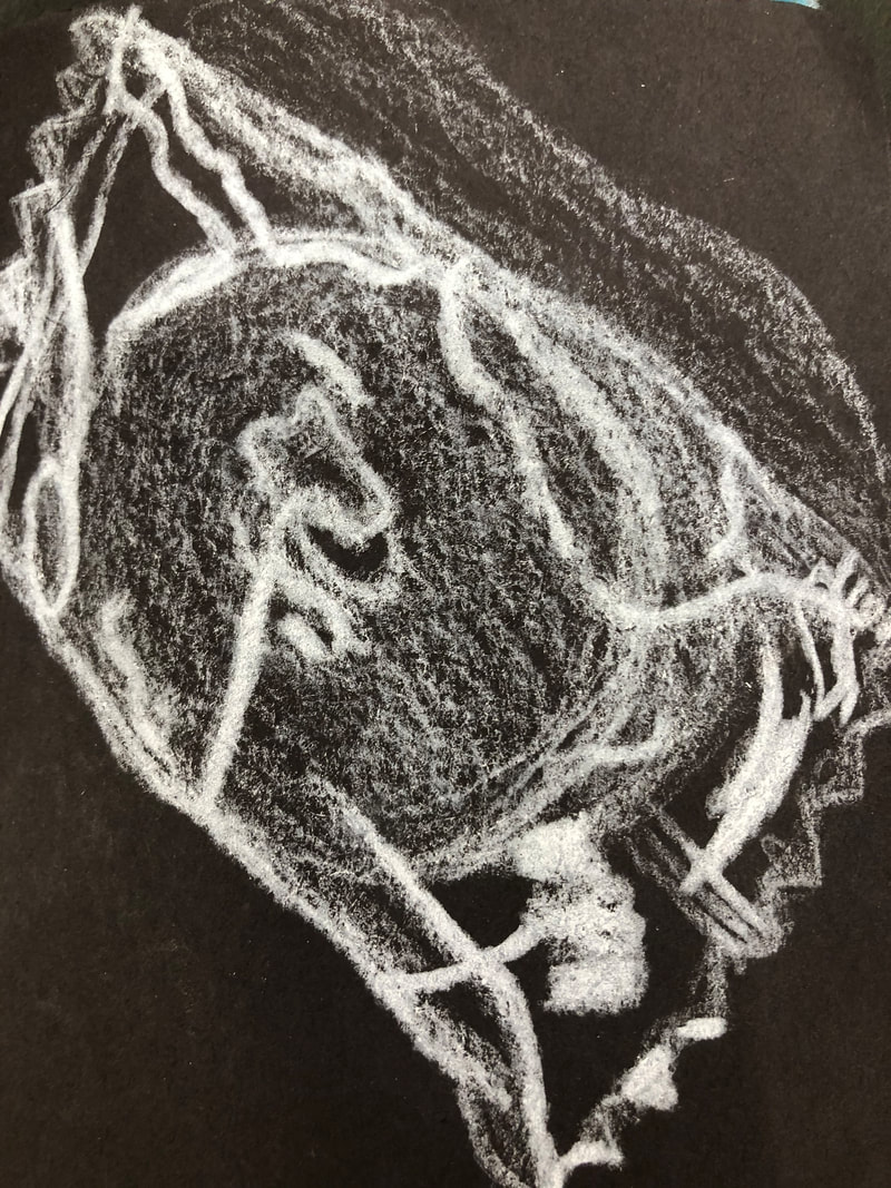
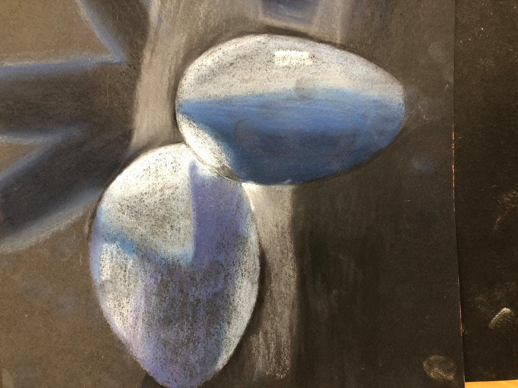
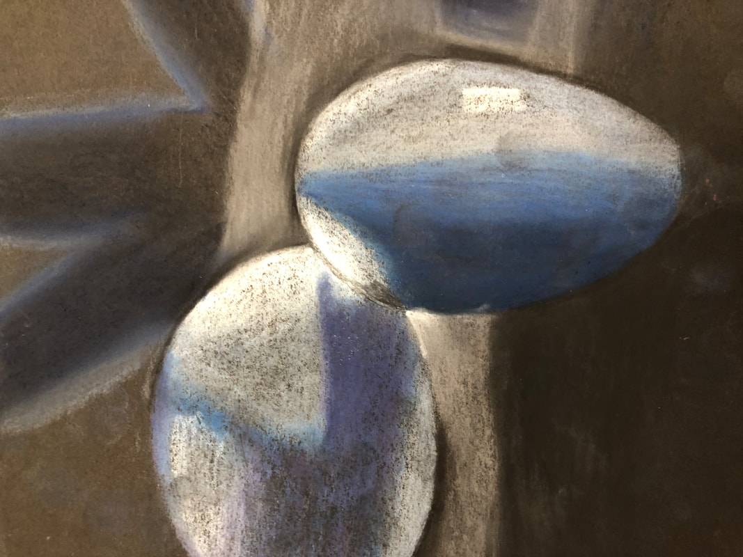
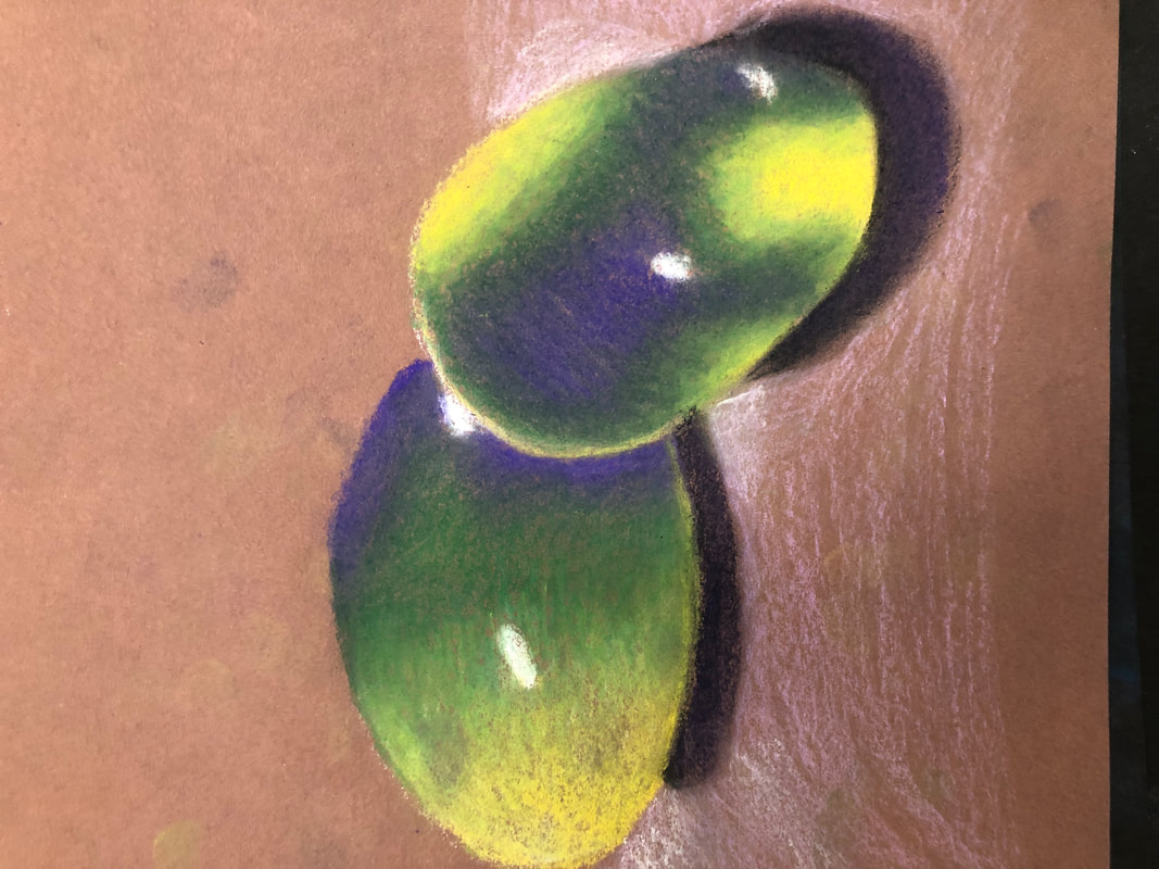
eggswe practiced using pastel pencils and then took pictures of eggs using interesting light sources. After that we drew the eggs using the pastel pencil.
|
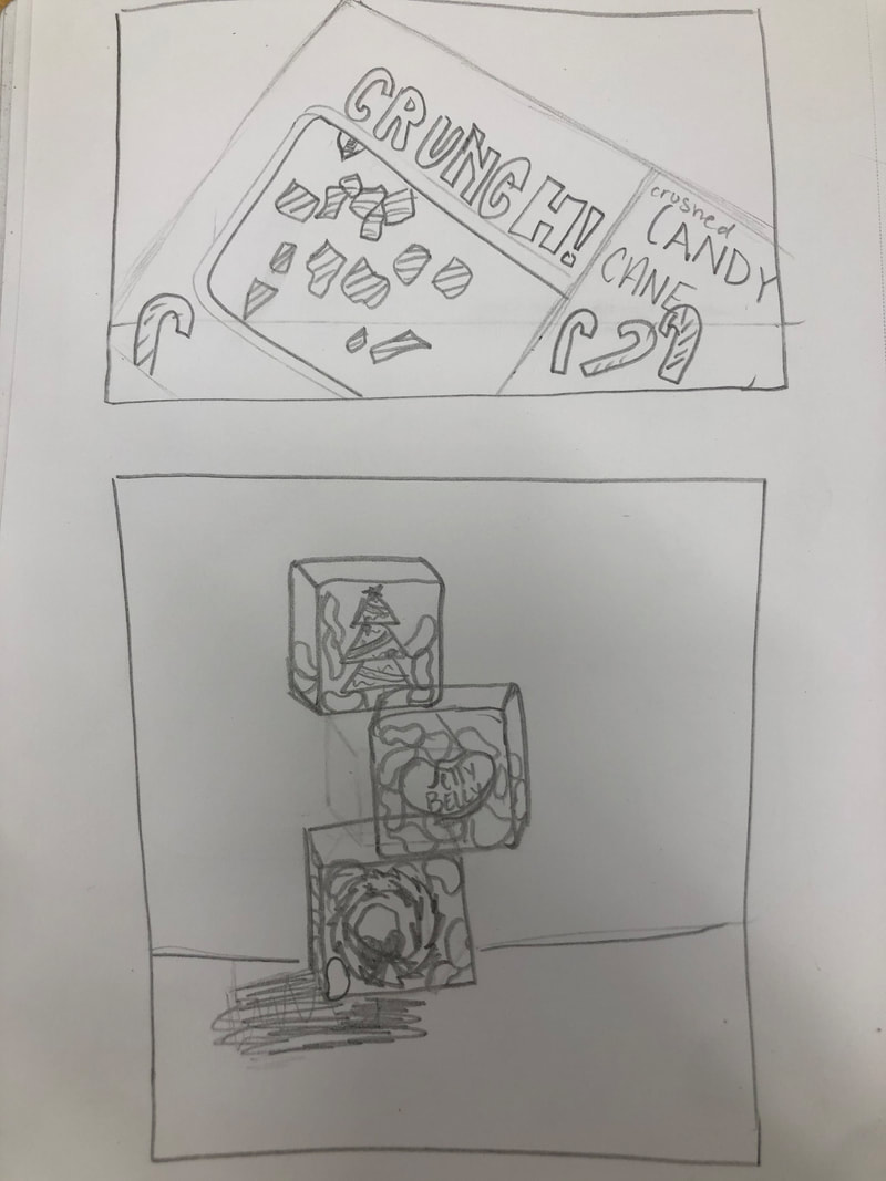
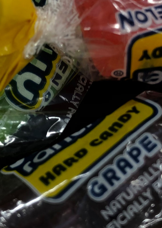
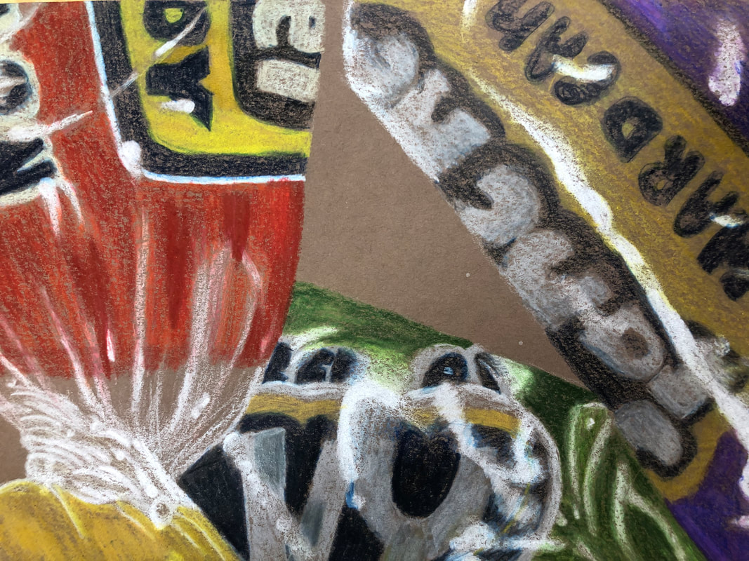
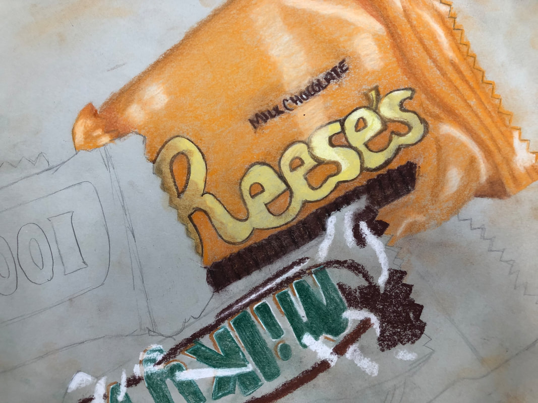
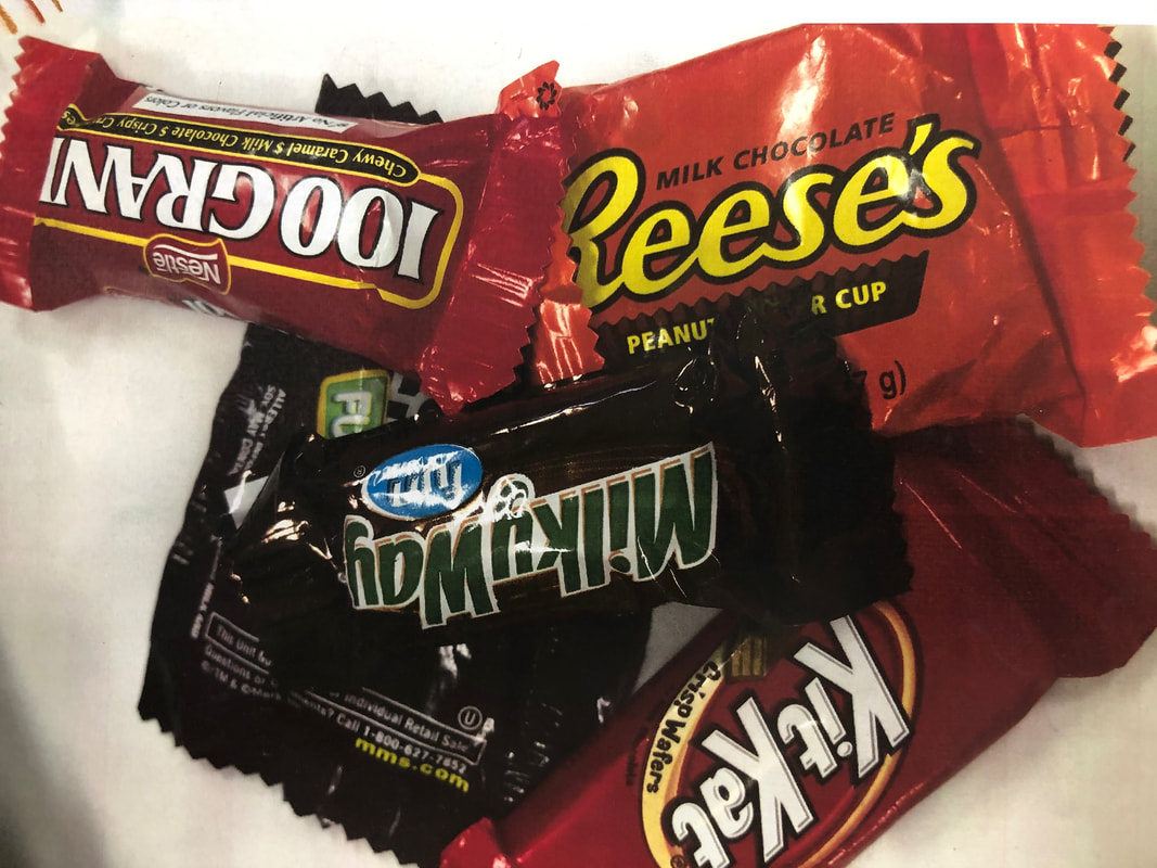
Halloween CandyWe took pictures of halloween candy and then drew the picture using pastel pencils, we had to draw the details of the candy packaging name and the where the light hits.
|
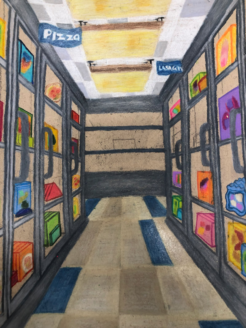
Look at that view final
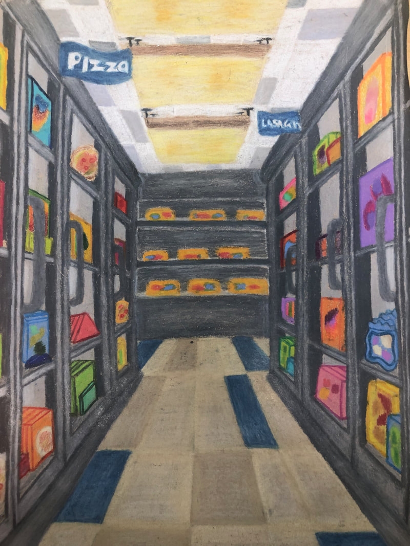
1. I created an interesting point of view by creating a perspective piece of a grocery store aisle. I think it was successful for the most part but unsuccessful in the exact tilt and measurements of the food products in the freezers.
2. It is important to understand perspective because it helps create an experience using art and showing the different point of views of people and places. It is important to know how to draw it to show your own point of view.
3. The colored pencil exercises were important to teach how to use prismacolors, as this was my first time using them. It taught me how to blend the colors, how to layers, and how to create different effects using the pencils.
4. The techniques used were the shading and using the circles to blend the colors. I also using the layering technique where you start with the lightest shade and build onto it with progressively darker shades, then go back over it with the lighter colors to blend. The project is crafted pretty well, the colors are blended pretty well.
5. I think I was able to show a relative amount of depth showing foreground, middleground and back-ground You can see where the aisle ends and turns into another type of aisle. I struggled using darker shades as I got farther back in the picture so the shading doesn't help to show depth.
6.My disadvantages for using colored pencils was how I still struggle blending and how I never used prismacolors before. My obstacles were realizing that I shaded too dark and couldn't shade any darker to show how far away something is. The experience was really good though, I really enjoyed using fun bright colors and making doing a pattern.
7. I feel like I was prepared for this project, I had all the knowledge of what I needed to do and had the instructions. I just didn't apply them as well as I could have and need to work on my skills more.
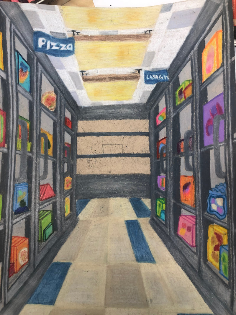
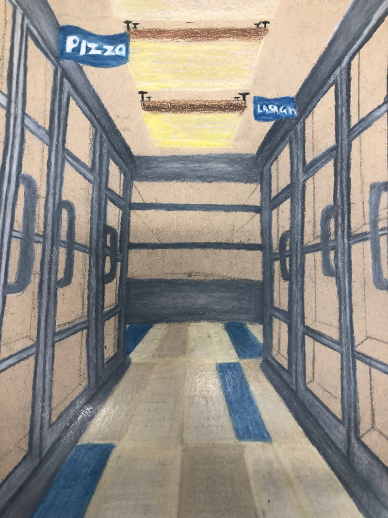
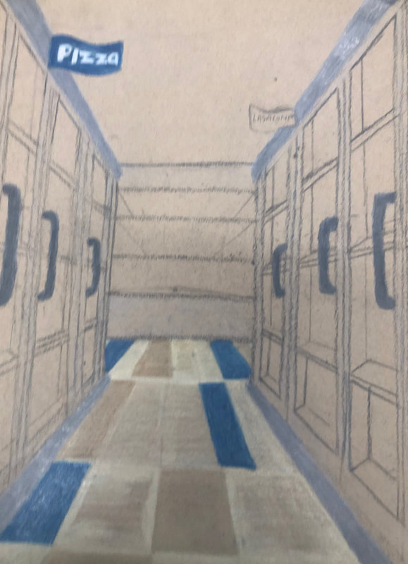
Look at that view in progress photos
|
|
My in progress photos for Look at That View.
|
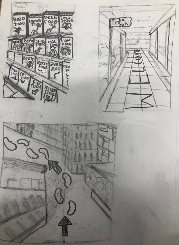
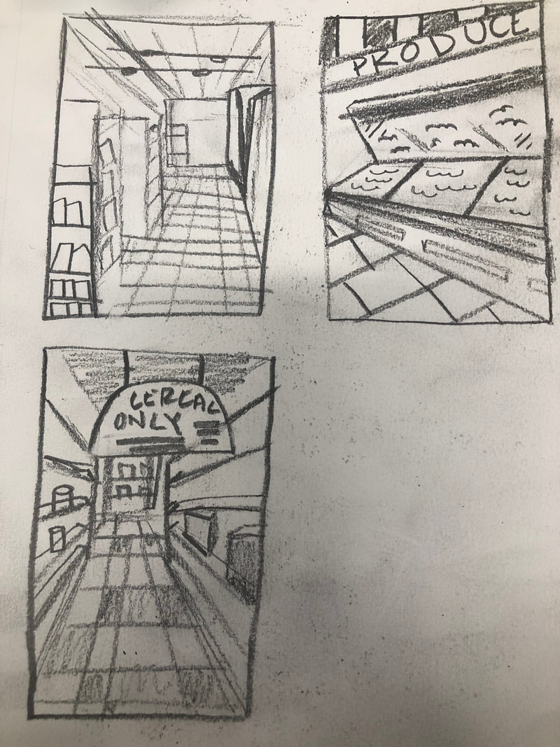
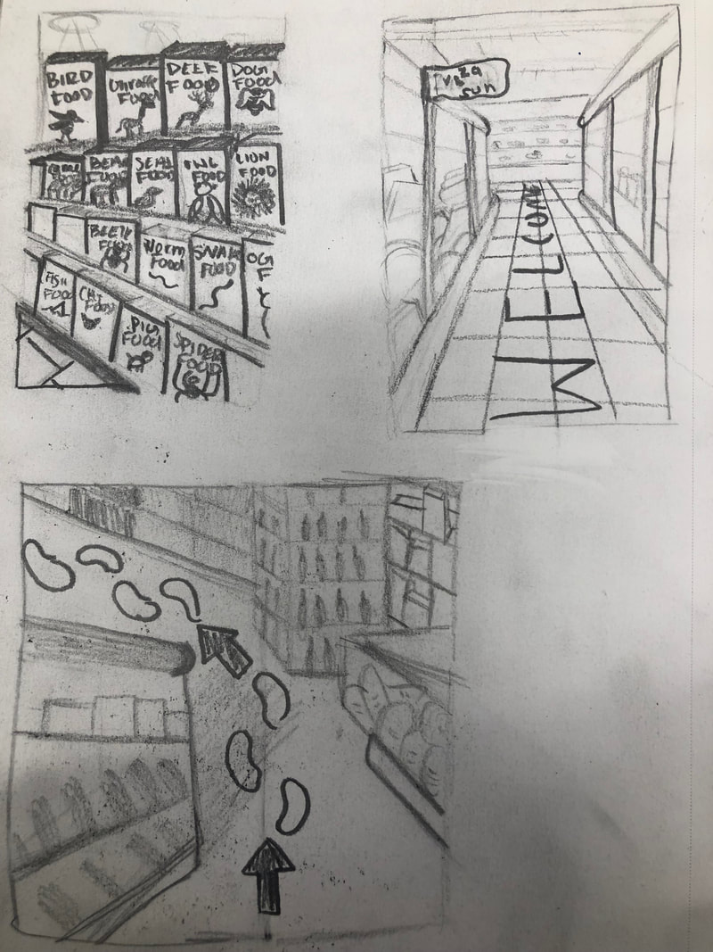
Look at that view Sketches |
Look at that view brainstorming |
|
|
|
|
My Sketches for the reference photos. I changed bits and pieces for each sketch based off a photo.
|
Me and Kylie brainstormed ideas for perspective drawings
|
Look at that view reference photos
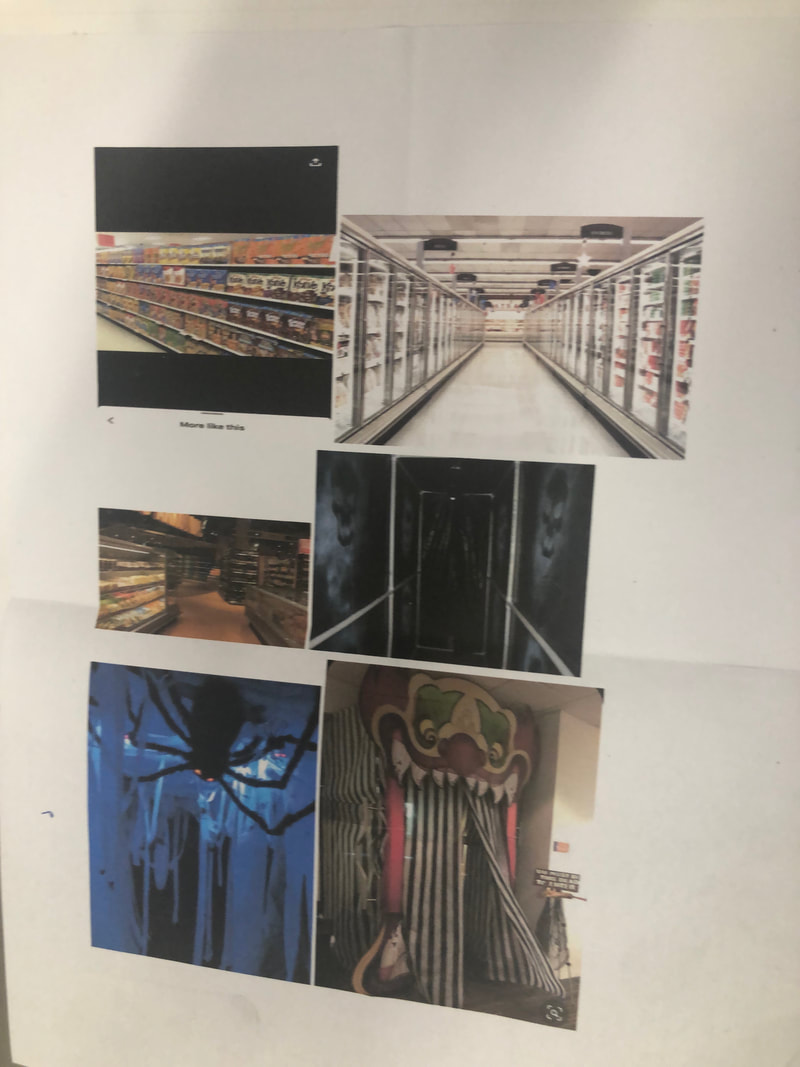
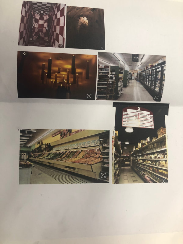
my reference photos from pinterest that I printed out and pasted inside o f my sketchbook
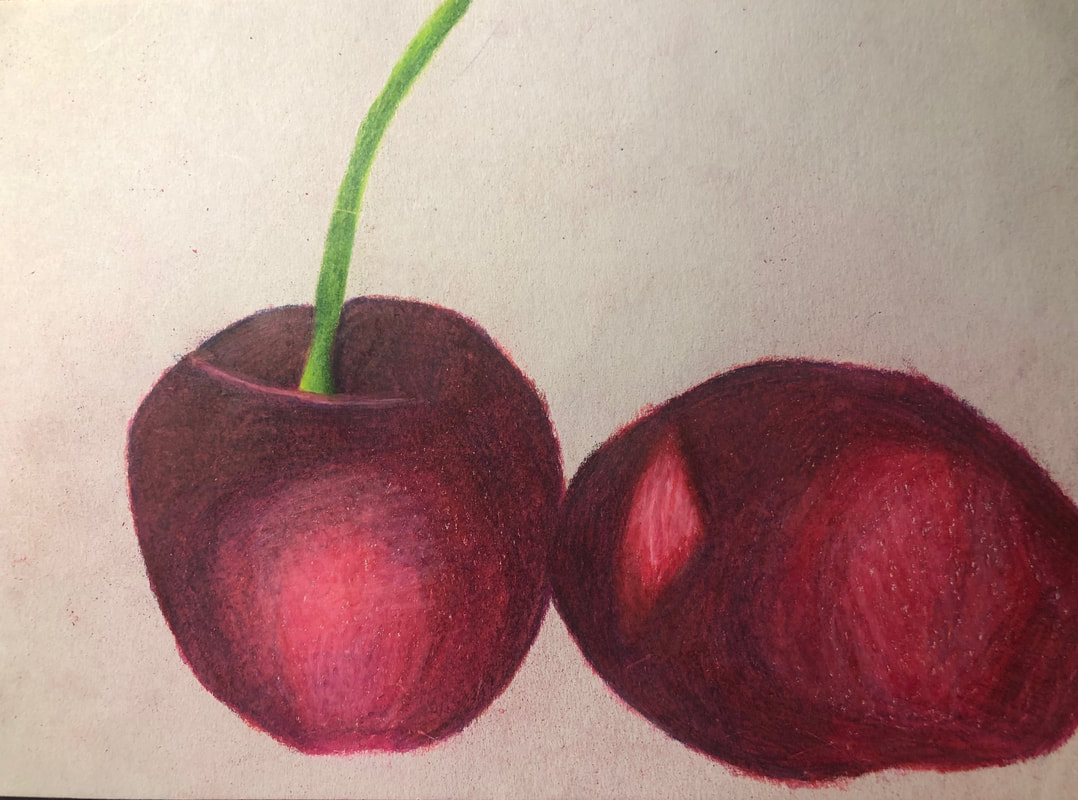
fruit prisma color drawing |
prismacolor shading practice |
|
drawing a fruit using prismacolors and shading. trying to use different colors other than red to shade in the colors.
|
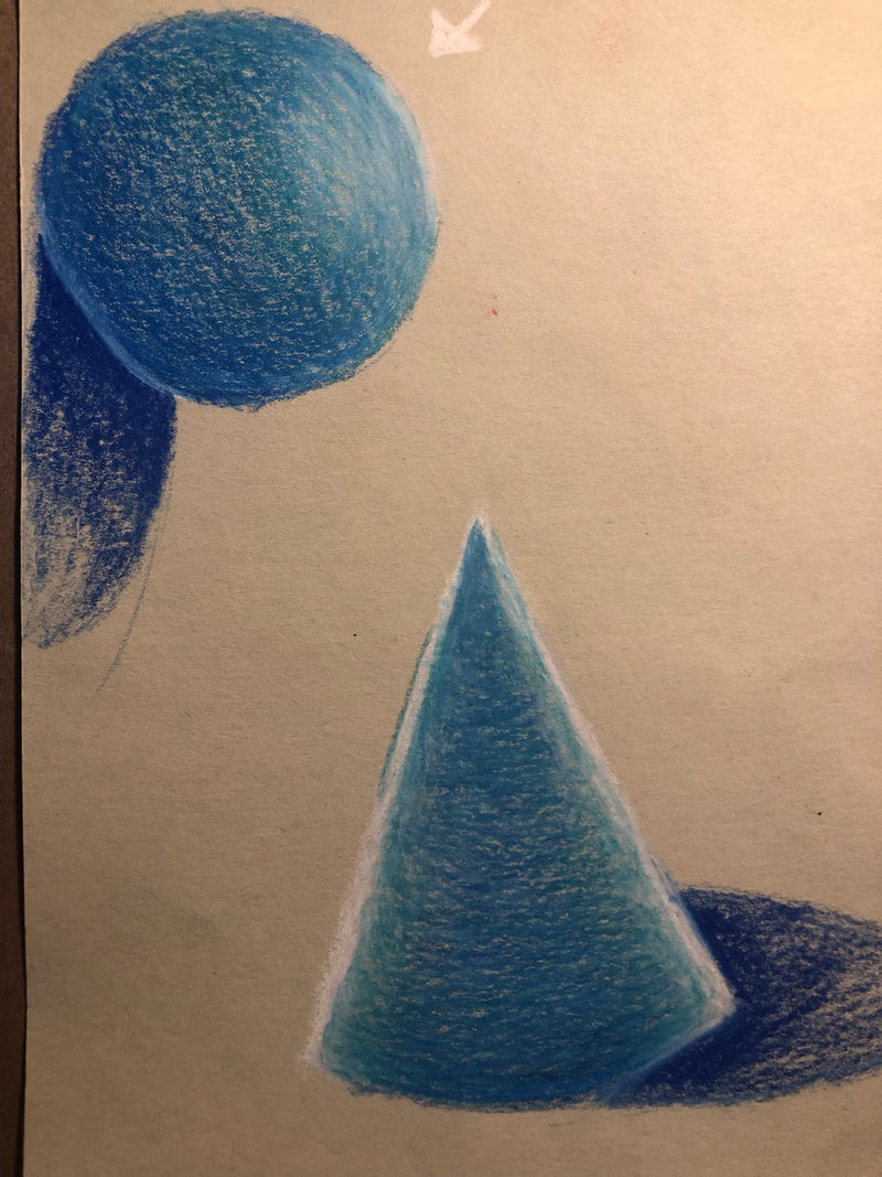
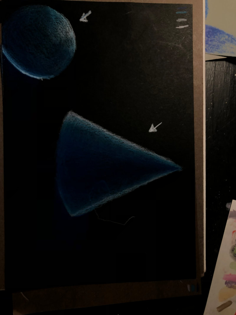
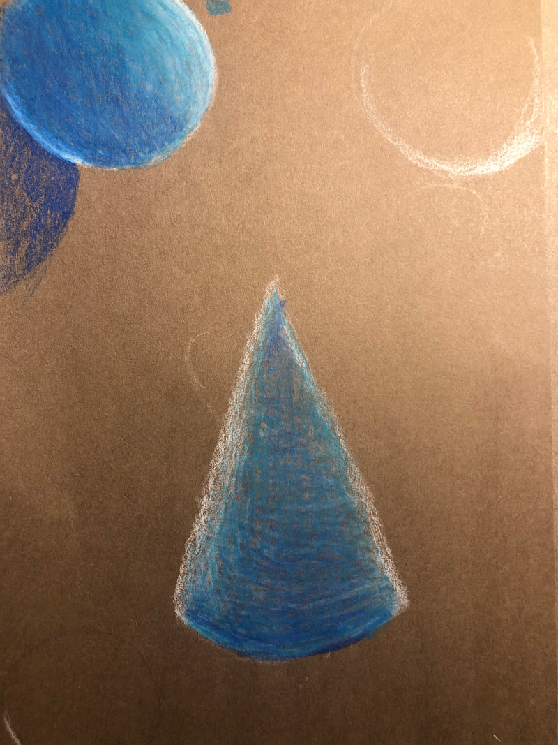
drawing a sphere and cone on three different colors of paper to test out prismas.
|
5 Perspective Drawings - video drawings
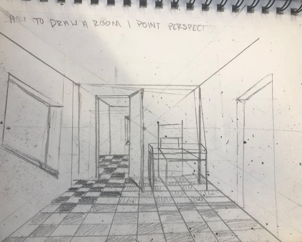
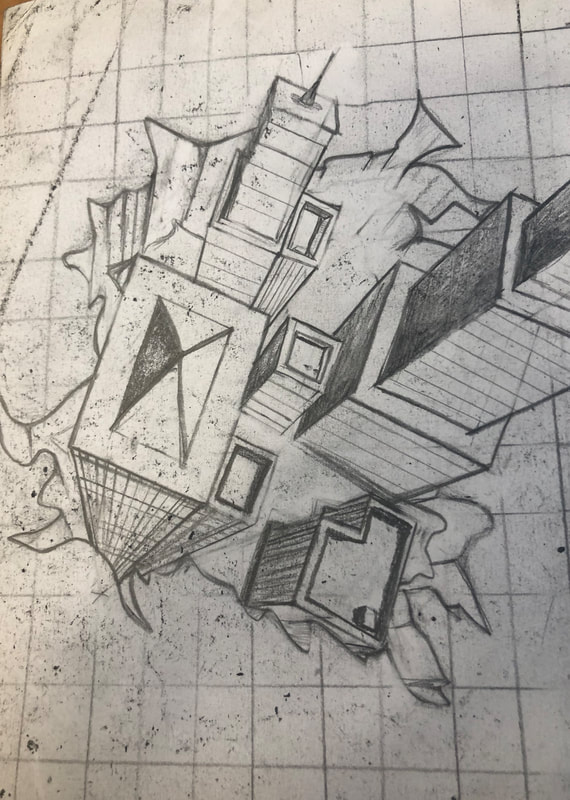
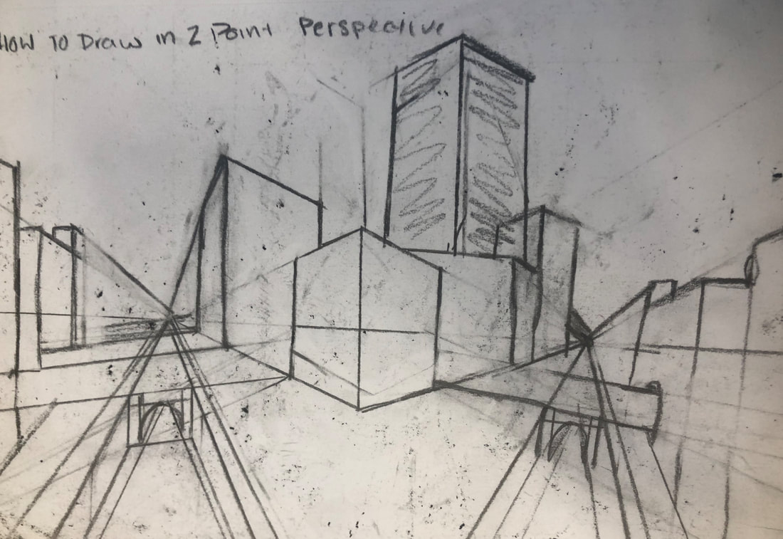
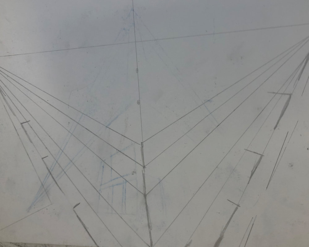
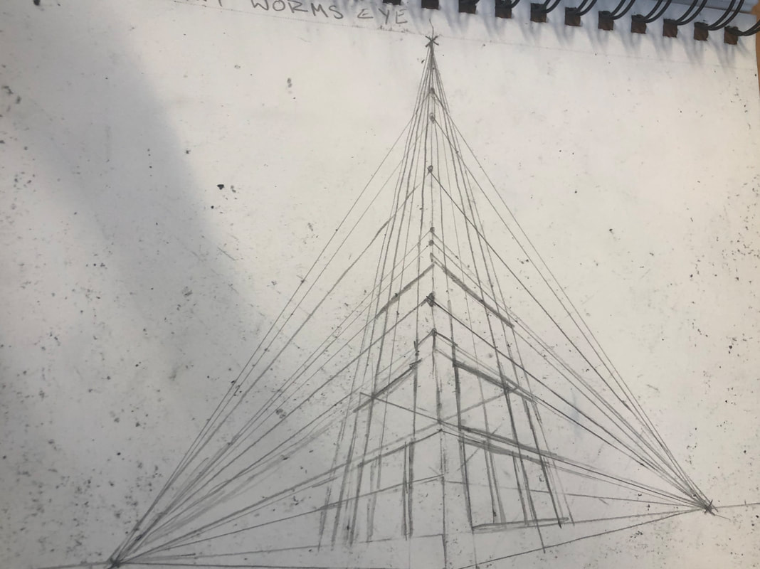
we watched videos on how to draw different perspectives using a ruler and followed along with the steps in the video
Reference Photos and sketches for Still Life
|
|
|
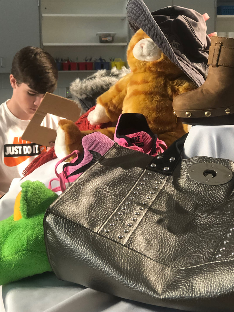
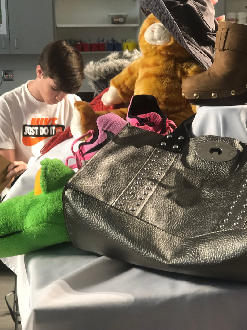
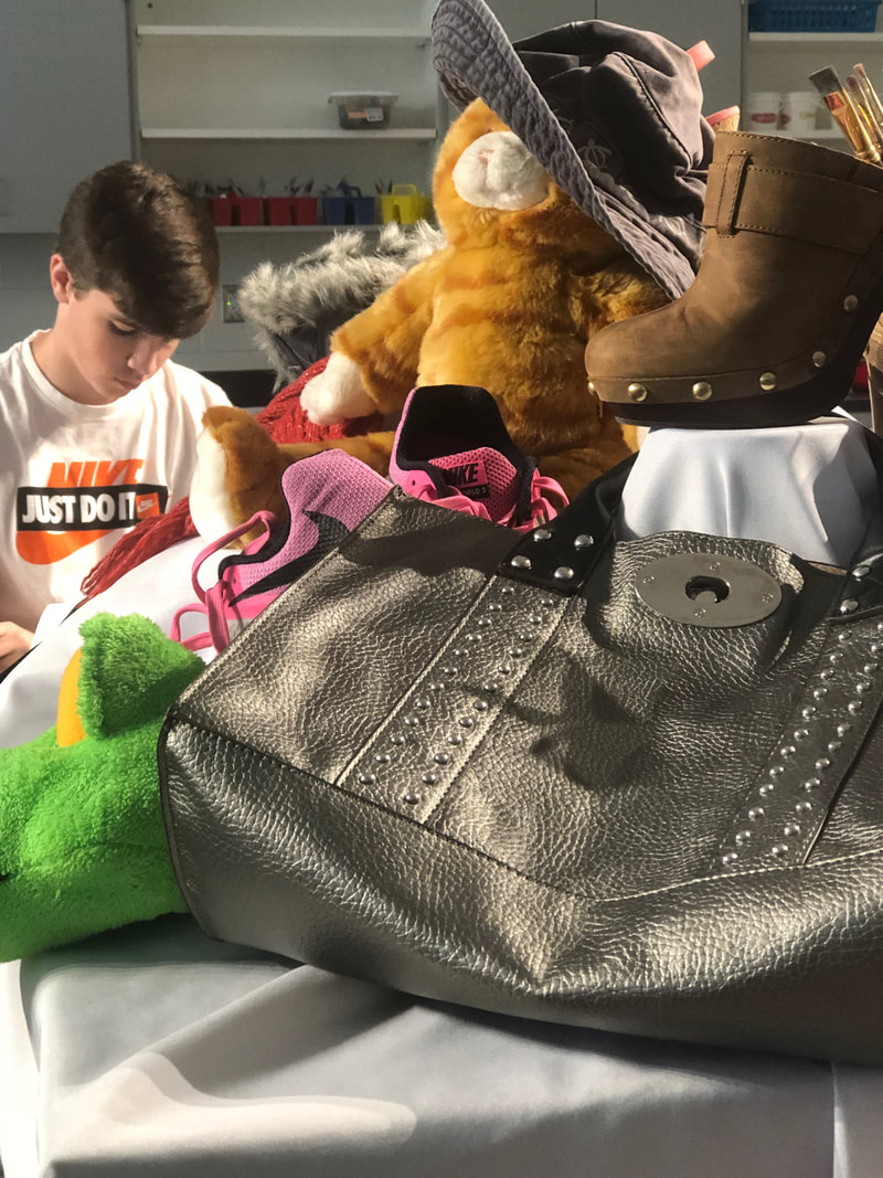
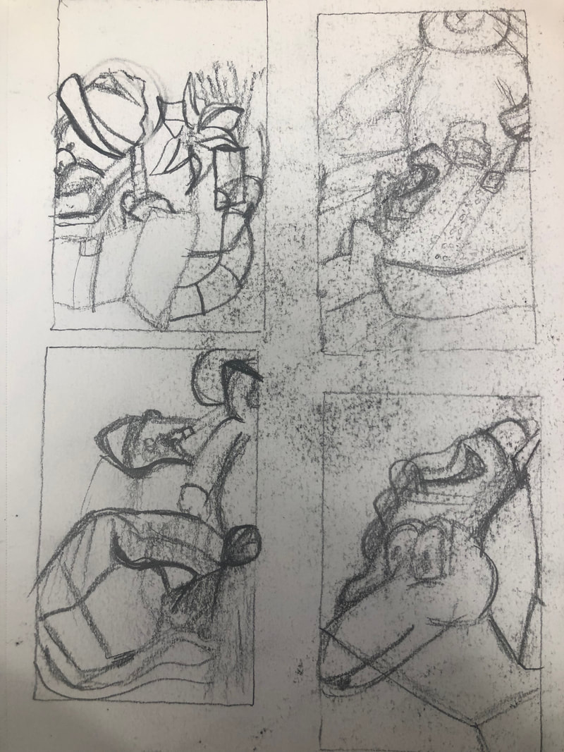
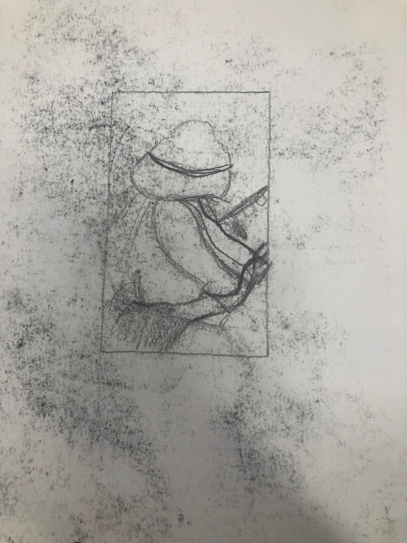
The sketches are based off different point of views moving around to different seats. the reference photo is what I used for my final piece.
In Progress Photos of Still Life
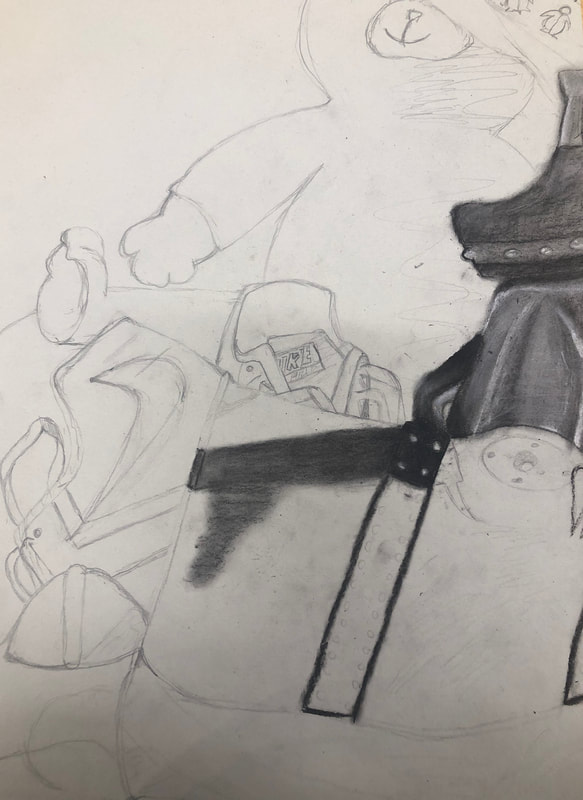
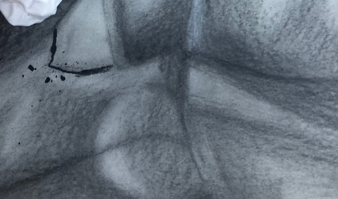
These are my in progress pictures, showing when i started, when i lightened up areas , and when i darkened the edges of objects.
Still life Critique Questions
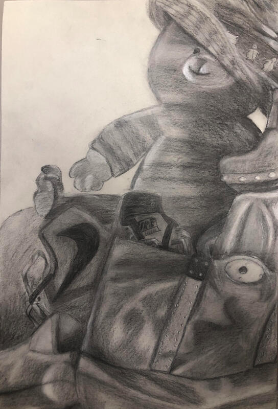
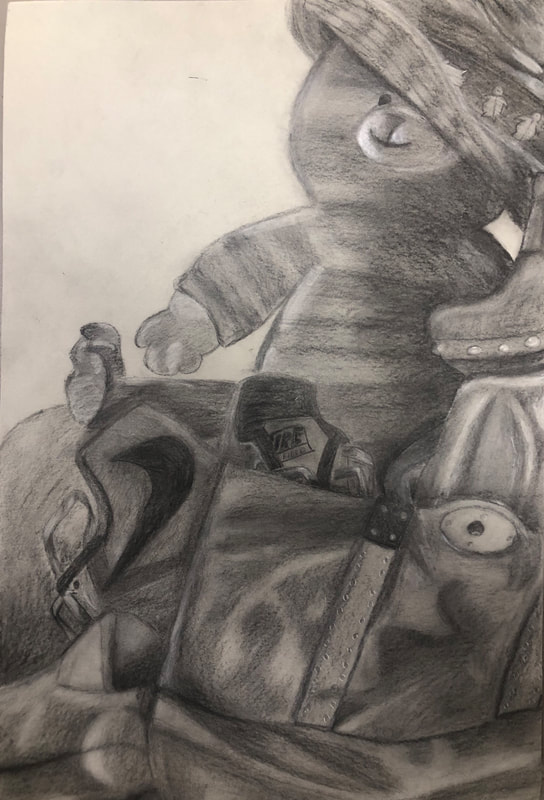
Final Product^
1. The charcoal on the drawing is blended pretty well and it has mostly clean edges with just some edges being a little too blended out. There snot really any smudges and it is a clear drawing of the still life, you can tell what and wear everything was.
2. I included all the values in the drawing, even leaving some areas clear to look like the lightest shade.My values are a little unrealistic as they are so dark. Values are important to show life like features and things.
3. There is a clear source of lighting coming from the left side of the drawing. It is seen mainly on the bear/cat and the purse.
4. i find that the compositional sketches were extremely important. I learned from those sketches how to properly place and shade shadows of shapes. I also learned about how to shade the shape itself with which sides should be darker and how parts should be lighter.
5. My final drawing is successful because it does have clear values and shading. Its also successful in showing the parts that light hit on.
6. The proportions are off in everything except the snake head. the bear and purse are too little while the sneakers are too big. The structure is okay, it doesn't show the correct size of things though. The perspective is pretty accurate as it shows the same position and lighting on the picture
7.The placement and groupings of objects create a little bit of a pleasing arrangement. The darker shading makes it a little harder to tell exactly how everything is placed, but it is pleasing in the areas you can tell are placed in front and behind objects.
8.My center of interest is not as well located as it could have been. The center of interest is the top of the nike shoe above the purse because of the contrasts and the letters spelling NIKE and FIELD.
9. I finished about on time/ a little early on tuesday. I managed my resources relatively well. I could maybe work on taking more time on my drawing next time, as i finished faster than others. I need to dedicate more time working on making my drawing look more realistic.
10. I encountered the challenge of using really dark shades and values. I overcame this by lightning areas up for the correct contrast and lighter areas.
11. I have learned that it is really difficult to make objects look realistic and its hard to get the perfect shading anywhere.
Fabric Studies
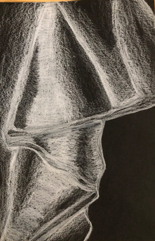
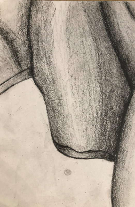
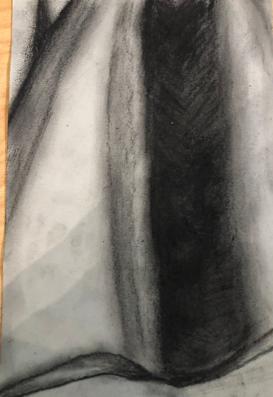
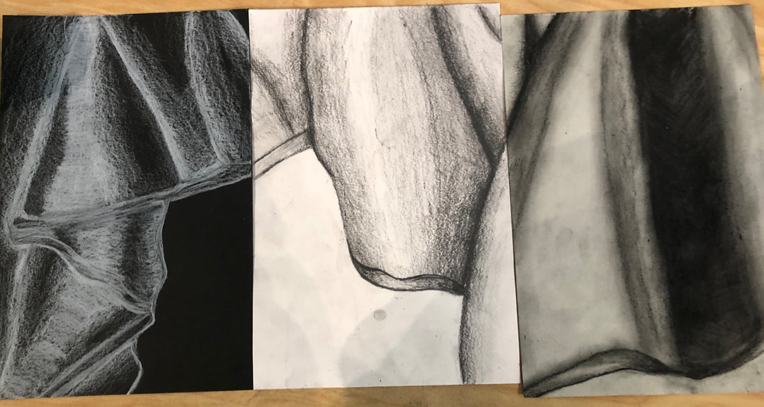
For this drawing series type we looked at a piece of fabric at the front of the class and the. used different mediums on different colors of paper to try to draw the fabric. We used shading and value for this. I combined all my pieces so they create one strip of fabric, as seen in the last picture. The white piece of paper is drawn with a regular 4B pencil, the black piece is drawn with a white colored pencil, and then the grey piece is done in charcoal pencil .
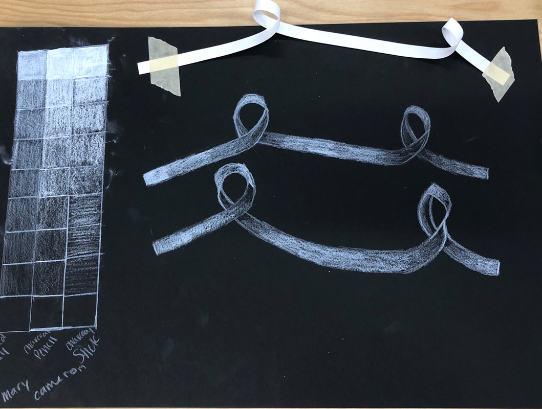
Ribbon Shading and White Value Chart
We used three different white mediums to create a value chart for drawing on black paper. These were charcoal, s white colored pencil snd white charcoal pencil. we then used these mediums as well as shading and value to create a drawing of the ribbon taped to the paper..
Form Still Life Drawing
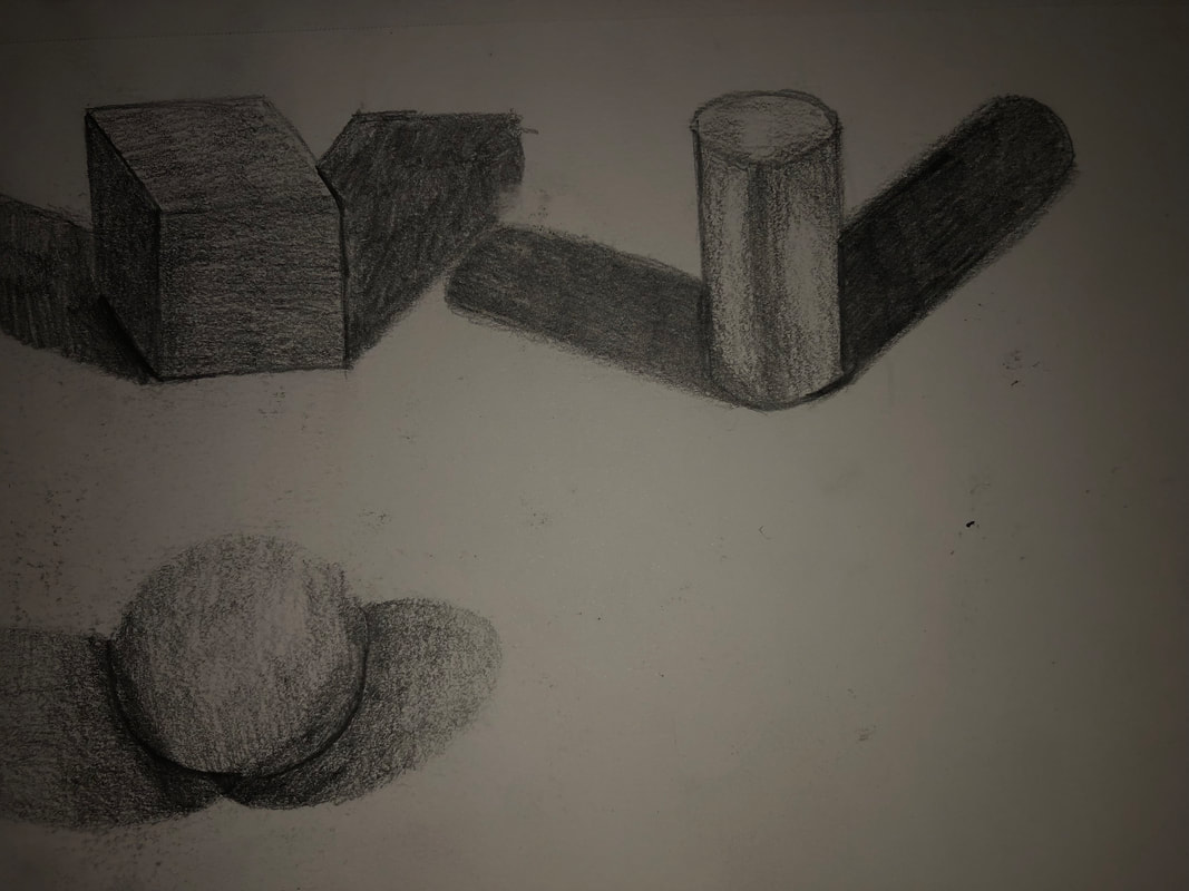
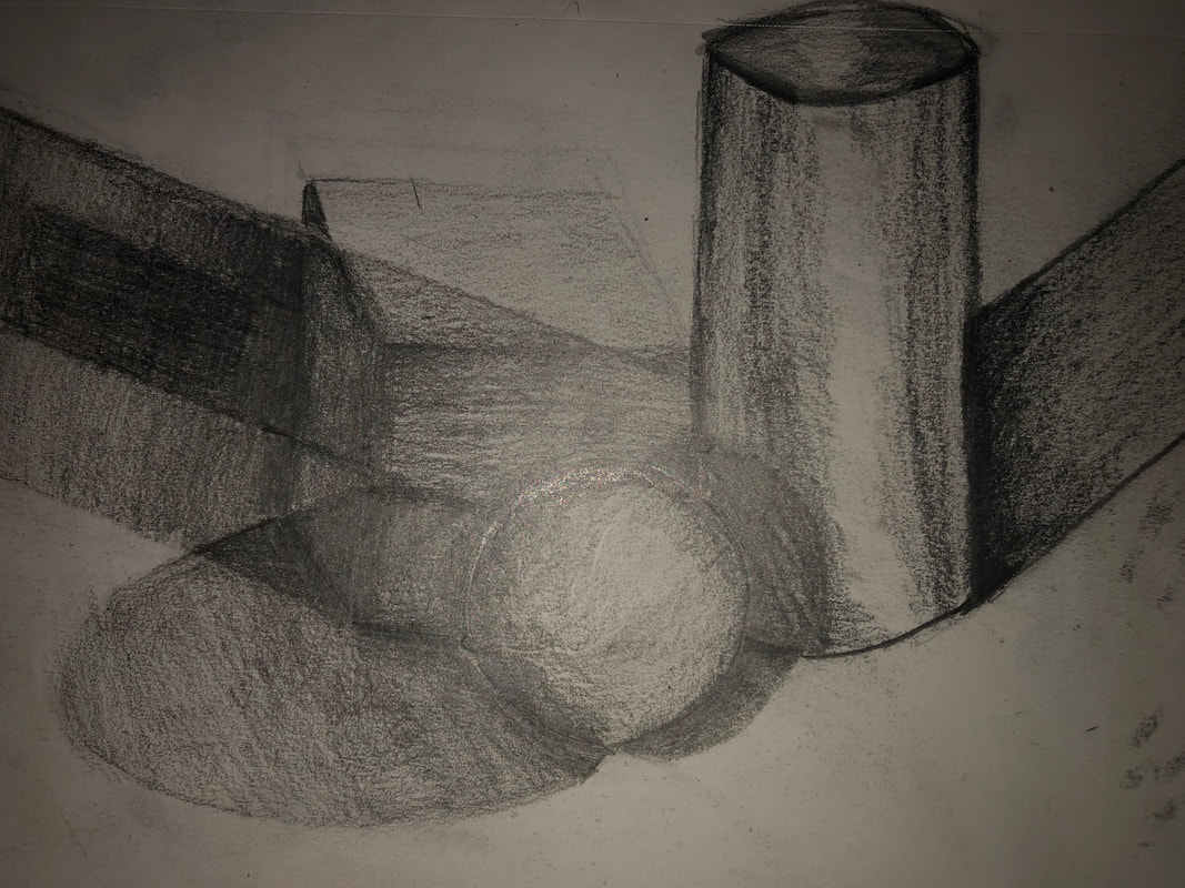
We used shading and value to create a still life of shapes. First we drew the shales seperate then combined them to show the shadows they cast on each other snd how to show depth.
Value Chart and Shape Shading
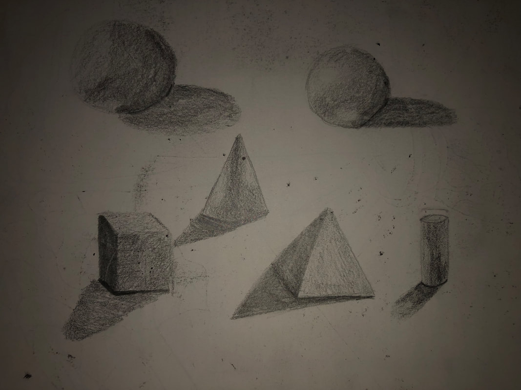
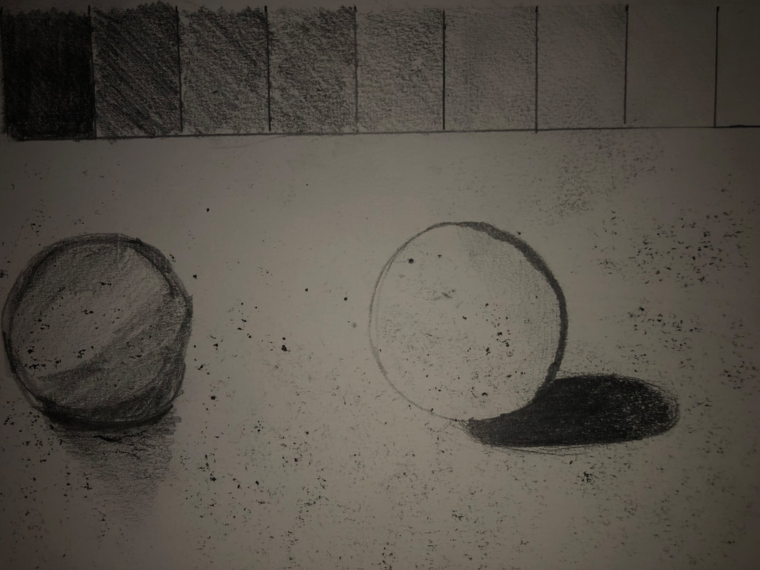
This is when we first started to use value. I have never learned about value and shading before but i found it very cool and interesting. It is more difficult than I thought but with some practice I feel like i could be somewhat decent at it. We first started out by shading a sphere and creating a value chart. Then we followed along with s video showing us other shapes we could add value to.
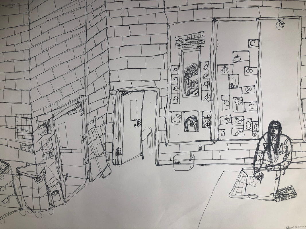
Contour Room Drawing
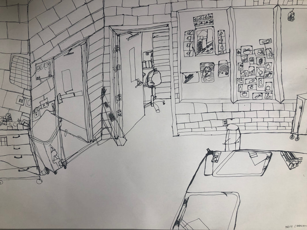
Above is my final room drawing. Below is my practice.
Contour Room Drawing Self Evaluation
1. Did I use a fluid Line? I struggled to use a fluid line, but I tried my hardest to not life my pen even if the drawing itself was sketchy. I tried really hard to not be sketchy also but it was a real struggle as I have never used fluid lines before.
2. My knowledge and creating practice studies with contour line contributed to the success of my piece. I had no prior knowledge of contour lines at all. I have actually never really learned about drawing and this kind of technique and found it very cool to learn about. I really enjoyed the contour lines and the idea of capturing all the little lines and details of sorts in one fluid line.
3. the difference in my contour line drawing to an outline drawing. My contour ie drawing is different to an outline drawing because it captures more details than an outline drawing would have. Because I made my piece more sketchy, it also different in that way as you would probably not see that in an outline drawing.
4. how my interpretation of line is essential in capturing the look of the room. My interpretation of the line was essential in capturing the look of the room as I used it to show dimensions in the room.
5. What did i learn from completing this Drawing? If I could recreate my piece what would I do differently to enhance the final outcome?
Hand Drawings
blind and modified
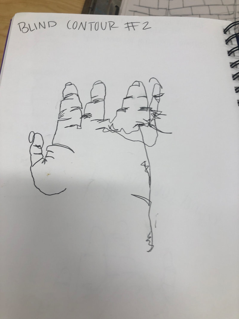
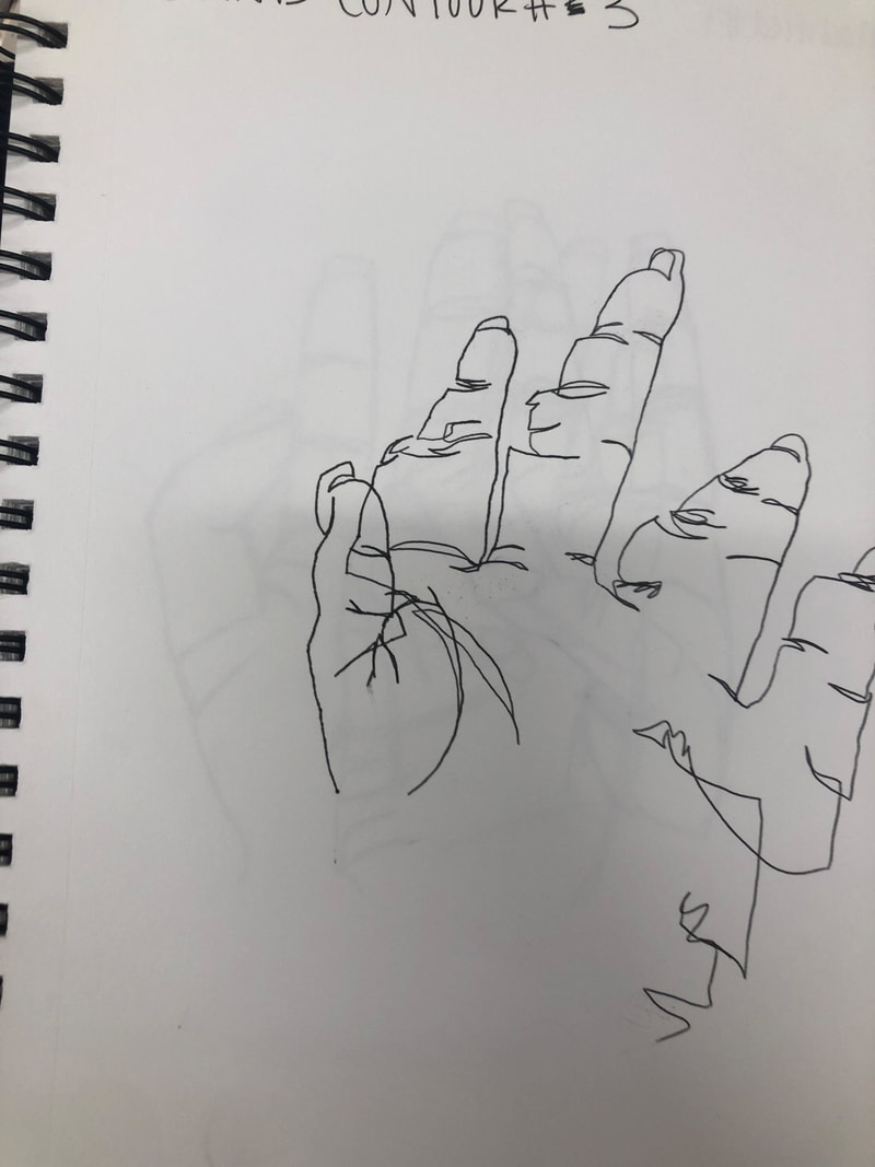
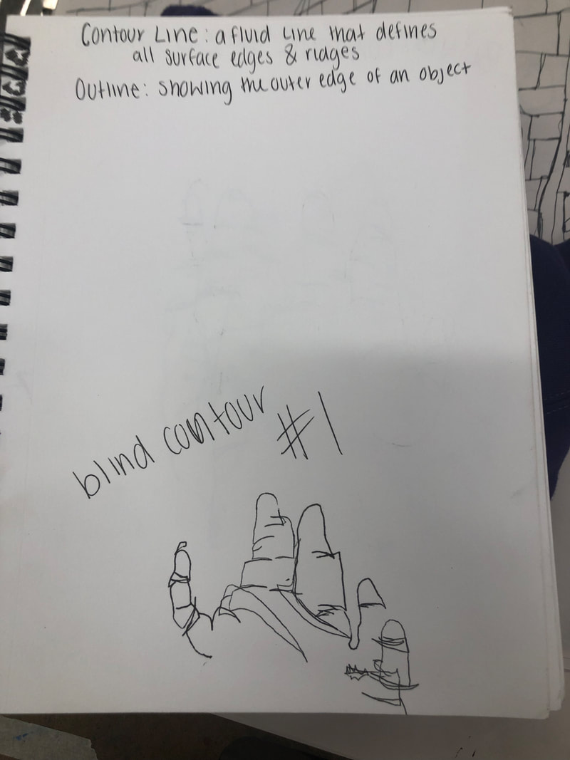
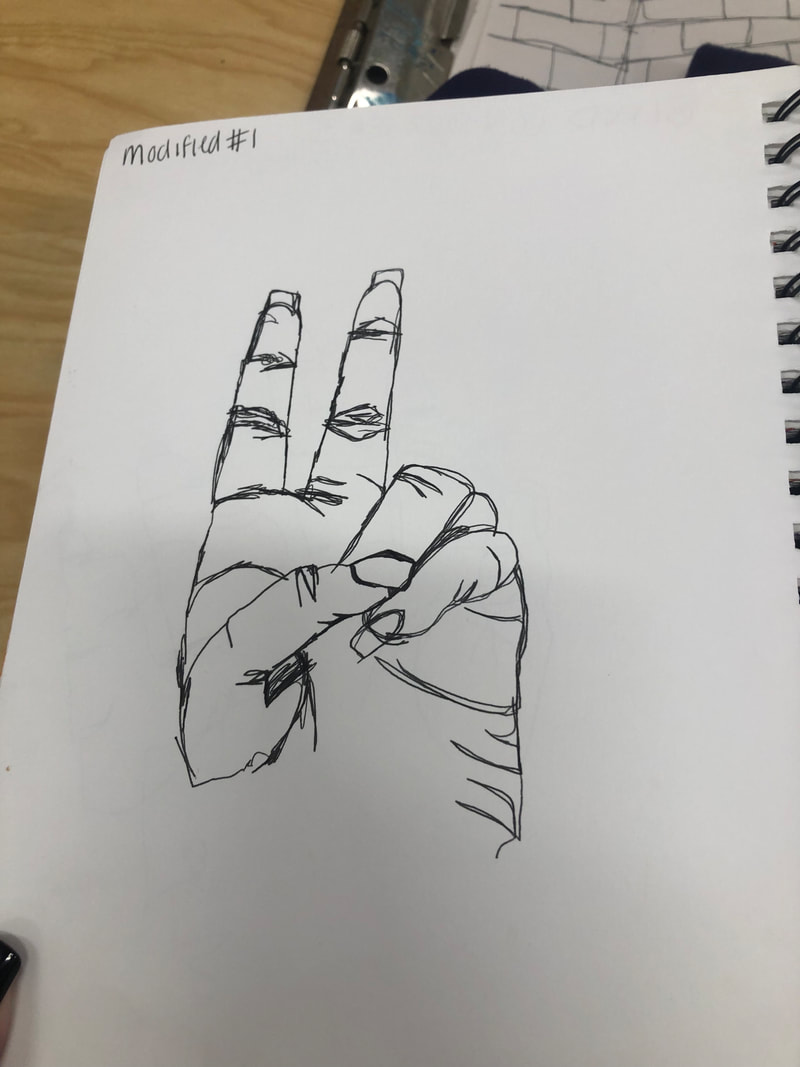
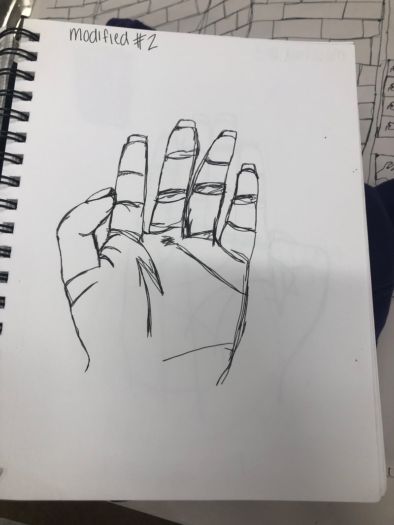
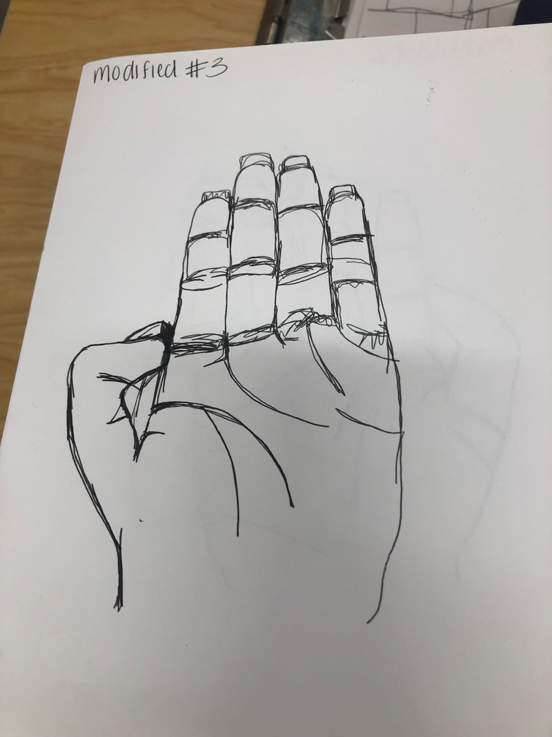
We used contour lines to draw hands. We did three of them blind and the other three looking at the paper.
Contour Drawing - Backpack
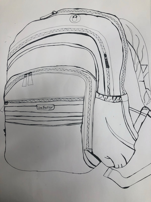
Last week we tried to contour draw a backpack. We looked at the backpack right in front of us and tried to draw it with out lifting the pen. The attempt was to try and include all the lines on the backpack.
Contour Drawing - Shoe
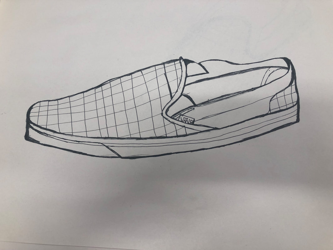
|
I took of my shoe and the table and I looked at the shoe and tried to draw it without lifting the pen. We tried to complete every line. This one was hard to finish not quickly and rushed at all.
|
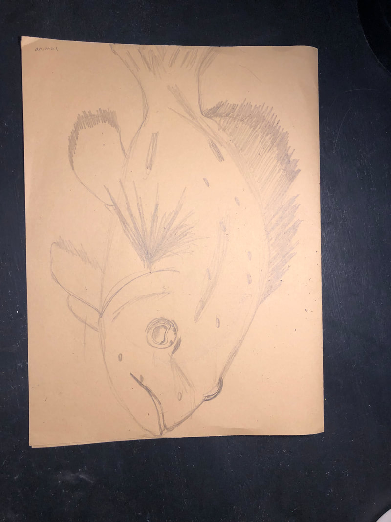
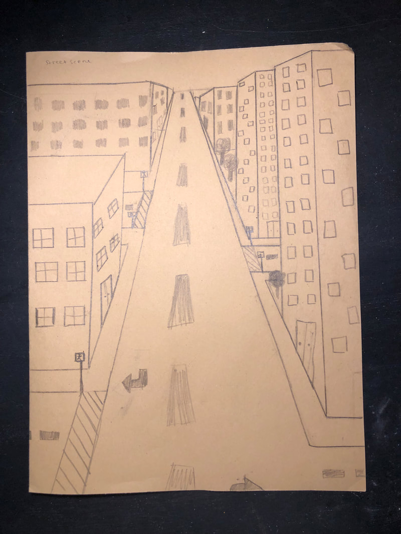
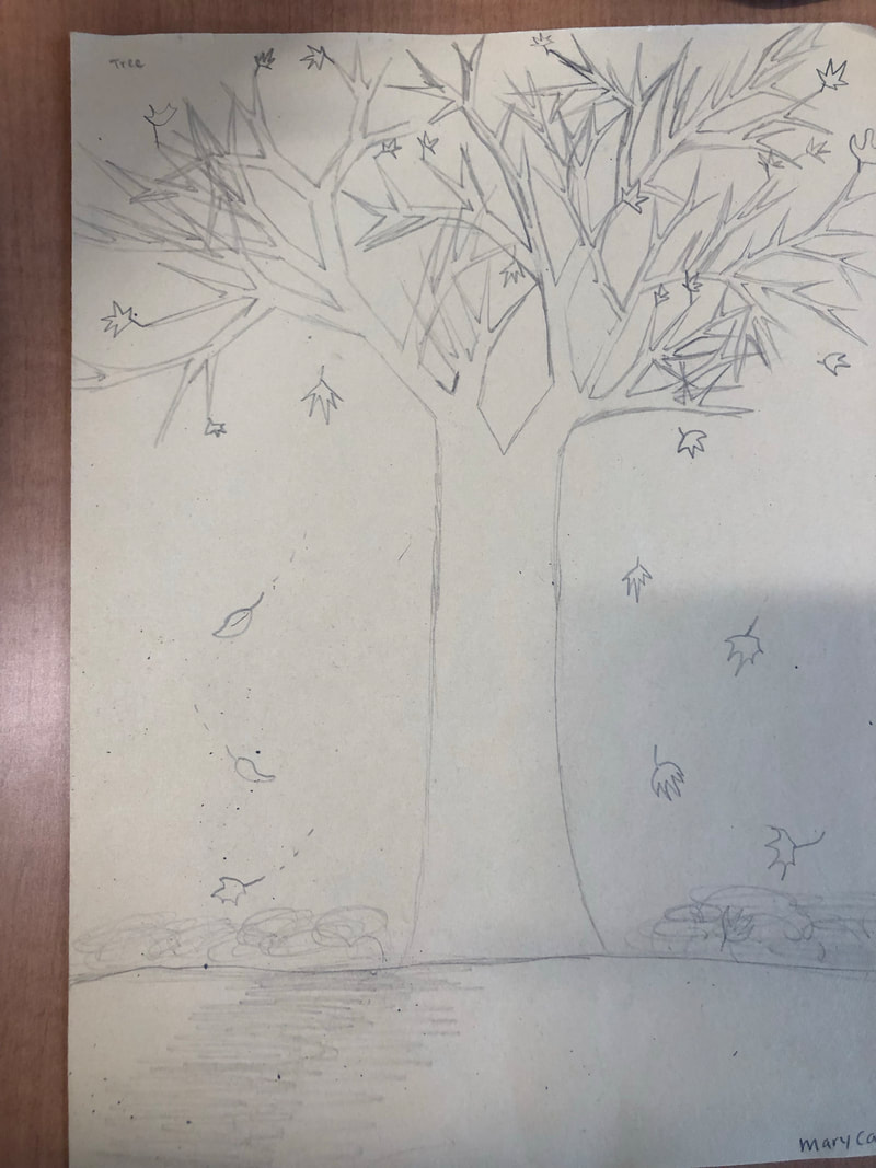
4 Drawings - First week of school
This was the assignment on the first day of school to draw four things; a tree, an animal, a street in 1 pt perspective, and a hand. i struggled a little bit with this.
